Interactive 3D Glassmorphism Card Component in React | Tilt Effect & Copy Button
import { useRef } from "react";
import "./GlassCard.css";

const GlassCard = ({
  image,
  badge,
  category,
  readTime,
  title,
  description,
  author,
  date,
  snippet,
}) => {
  const cardRef = useRef(null);
  const glareRef = useRef(null);
  const buttonRef = useRef(null);

  const handleMouseMove = (e) => {
    const card = cardRef.current;
    const glare = glareRef.current;

    const rect = card.getBoundingClientRect();

    const x = e.clientX - rect.left;
    const y = e.clientY - rect.top;

    const centerX = rect.width / 2;
    const centerY = rect.height / 2;

    const rotateX = ((y - centerY) / centerY) * -12;
    const rotateY = ((x - centerX) / centerX) * 12;

    card.style.transform = `rotateX(${rotateX}deg) rotateY(${rotateY}deg)`;

    glare.style.opacity = "1";

    glare.style.background = `radial-gradient(
      circle at ${x}px ${y}px,
      rgba(255, 255, 255, .18),
      transparent 60%
    )`;
  };

  const handleMouseLeave = () => {
    cardRef.current.style.transform = "rotateX(0deg) rotateY(0deg)";
    glareRef.current.style.opacity = "0";
  };

  const copyCode = async (e) => {
    e.stopPropagation();

    try {
      await navigator.clipboard.writeText(snippet);

      const btn = buttonRef.current;
      const text = btn.querySelector(".btn-text");
      const icon = btn.querySelector(".btn-icon");

      text.textContent = "Copied!";
      icon.textContent = "✅";

      btn.classList.add("copied");

      setTimeout(() => {
        text.textContent = "Copy Code";
        icon.textContent = "📋";
        btn.classList.remove("copied");
      }, 2000);
    } catch (err) {
      console.log(err);
    }
  };

  return (
    <div className="card-container">
      <div
        ref={cardRef}
        className="glass-card"
        onMouseMove={handleMouseMove}
        onMouseLeave={handleMouseLeave}
      >
        <div ref={glareRef} className="card-glare"></div>

        <div className="card-image-wrap">
          <img src={image} alt={title} className="card-img" />
          <span className="badge-tag">{badge}</span>
        </div>

        <div className="card-content">
          <div className="card-meta">
            <span className="meta-item">{category}</span>
            <span className="meta-item">{readTime}</span>
          </div>

          <h2 className="card-title">{title}</h2>

          <p className="card-description">{description}</p>

          <div className="card-footer">
            <div className="author-info">
              <div className="author-avatar">
                {author.charAt(0).toUpperCase()}
              </div>

              <div>
                <div className="author-name">{author}</div>
                <div className="post-date">{date}</div>
              </div>
            </div>

            <button
              ref={buttonRef}
              className="btn-copy"
              onClick={copyCode}
            >
              <span className="btn-text">Copy Code</span>
              <span className="btn-icon">📋</span>
            </button>
          </div>
        </div>
      </div>
    </div>
  );
};

export default GlassCard;
/* ========================================================
GLOBAL RESETS & GLASSLAND BACKGROUND
======================================================== */
* {
margin: 0;
padding: 0;
box-sizing: border-box;
font-family: "Segoe UI", system-ui, -apple-system, sans-serif;
}
body {
min-height: 100vh;
display: flex;
justify-content: center;
align-items: center;
background: #0B0F19;
background-image:
radial-gradient(
at 0% 0%,
rgba(99, 102, 241, 0.18) 0px,
transparent 50%
),
radial-gradient(
at 100% 100%,
rgba(168, 85, 247, 0.18) 0px,
transparent 50%
);
overflow: hidden;
padding: 1.5rem;
}
/* Container for 3D perspective field */
.card-container {
perspective: 1000px;
}
/* ========================================================
STYLISH GLASS CARD
======================================================== */
.glass-card {
width: 360px;
background: rgba(17, 24, 39, 0.7);
backdrop-filter: blur(16px);
-webkit-backdrop-filter: blur(16px);
border: 1px solid rgba(255, 255, 255, 0.1);
border-radius: 20px;
padding: 1.25rem;
box-shadow:
0 20px 40px rgba(0, 0, 0, 0.6),
inset 0 1px 0 rgba(255, 255, 255, 0.15);
position: relative;
overflow: hidden;
transform-style: preserve-3d;
transition:
transform 0.15s ease-out,
box-shadow 0.3s ease;
cursor: pointer;
}
.glass-card:hover {
box-shadow:
0 30px 60px rgba(0, 0, 0, 0.8),
0 0 30px rgba(99, 102, 241, 0.25),
inset 0 1px 0 rgba(255, 255, 255, 0.25);
}
/* Dynamic Glare Effect Overlay */
.card-glare {
position: absolute;
top: 0;
left: 0;
width: 100%;
height: 100%;
pointer-events: none;
background: radial-gradient(
circle at 50% 50%,
rgba(255, 255, 255, 0.15),
transparent 60%
);
opacity: 0;
transition: opacity 0.3s ease;
z-index: 5;
}
/* ========================================================
CARD MEDIA & BADGE
======================================================== */
.card-image-wrap {
position: relative;
width: 100%;
height: 190px;
border-radius: 14px;
overflow: hidden;
transform: translateZ(20px);
}
.card-img {
width: 100%;
height: 100%;
object-fit: cover;
transition:
transform 0.5s cubic-bezier(0.4, 0, 0.2, 1);
}
.glass-card:hover .card-img {
transform: scale(1.08);
}
.badge-tag {
position: absolute;
top: 12px;
right: 12px;
background: rgba(17, 24, 39, 0.75);
backdrop-filter: blur(8px);
color: #818CF8;
font-size: 0.75rem;
font-weight: 700;
padding: 0.35rem 0.75rem;
border-radius: 50px;
border: 1px solid rgba(99, 102, 241, 0.4);
box-shadow: 0 4px 12px rgba(0, 0, 0, 0.3);
}
/* ========================================================
CARD TYPOGRAPHY & BODY
======================================================== */
.card-content {
margin-top: 1.25rem;
transform: translateZ(30px);
}
.card-meta {
display: flex;
gap: 0.75rem;
font-size: 0.75rem;
color: #9CA3AF;
margin-bottom: 0.5rem;
}
.card-title {
color: #F9FAFB;
font-size: 1.25rem;
font-weight: 700;
line-height: 1.35;
margin-bottom: 0.5rem;
transition: color 0.2s ease;
}
.glass-card:hover .card-title {
color: #818CF8;
}
.card-description {
color: #9CA3AF;
font-size: 0.85rem;
line-height: 1.5;
margin-bottom: 1.25rem;
display: -webkit-box;
-webkit-line-clamp: 3;
-webkit-box-orient: vertical;
overflow: hidden;
}
/* ========================================================
FOOTER & INTERACTIVE BUTTON
======================================================== */
.card-footer {
display: flex;
align-items: center;
justify-content: space-between;
padding-top: 1rem;
border-top: 1px solid rgba(255, 255, 255, 0.08);
transform: translateZ(25px);
}
.author-info {
display: flex;
align-items: center;
gap: 0.6rem;
}
.author-avatar {
width: 34px;
height: 34px;
border-radius: 50%;
background: linear-gradient(
135deg,
#6366F1,
#A855F7
);
color: #ffffff;
font-weight: 700;
font-size: 0.85rem;
display: flex;
align-items: center;
justify-content: center;
border: 1px solid rgba(255, 255, 255, 0.2);
}
.author-name {
color: #F9FAFB;
font-size: 0.8rem;
font-weight: 600;
}
.post-date {
color: #6B7280;
font-size: 0.7rem;
}
.btn-copy {
background: linear-gradient(
135deg,
#6366F1,
#4F46E5
);
color: #ffffff;
border: none;
border-radius: 8px;
padding: 0.5rem 0.85rem;
font-size: 0.8rem;
font-weight: 600;
cursor: pointer;
display: flex;
align-items: center;
gap: 0.35rem;
transition:
all 0.2s cubic-bezier(0.4, 0, 0.2, 1);
box-shadow:
0 4px 12px rgba(99, 102, 241, 0.3);
}
.btn-copy:hover {
transform: translateY(-2px);
box-shadow:
0 6px 16px rgba(99, 102, 241, 0.5);
}
.btn-copy:active {
transform: translateY(0);
}
.btn-copy.copied {
background: #10B981;
box-shadow:
0 4px 12px rgba(16, 185, 129, 0.4);
}import GlassCard from "./components/GlassCard";
function App() {
return (
<div
style={{
minHeight: "100vh",
display: "flex",
justifyContent: "center",
alignItems: "center",
background: "#0B0F19",
}}
>
<GlassCard
image="https://images.unsplash.com/photo-1618005182384-a83a8bd57fbe?w=600&auto=format&fit=crop&q=80"
badge="⚡ React"
category="📁 Components"
readTime="⏱️ 5 min read"
title="Reusable Glass Card"
description="A reusable glassmorphism card component with 3D tilt effect, glare animation and copy button."
author="Rohan Kumar"
date="Aug 5, 2026"
snippet="npm install react"
/>
</div>
);
}
export default App;src/
│
├── components/
│ ├── GlassCard.jsx
│ └── GlassCard.css
│
├── App.jsx
└── main.jsxModern websites often use interactive UI components to make the user experience more engaging. One popular design trend is glassmorphism, where elements use transparency, blur effects, subtle borders, shadows, and gradients to create a glass-like appearance.
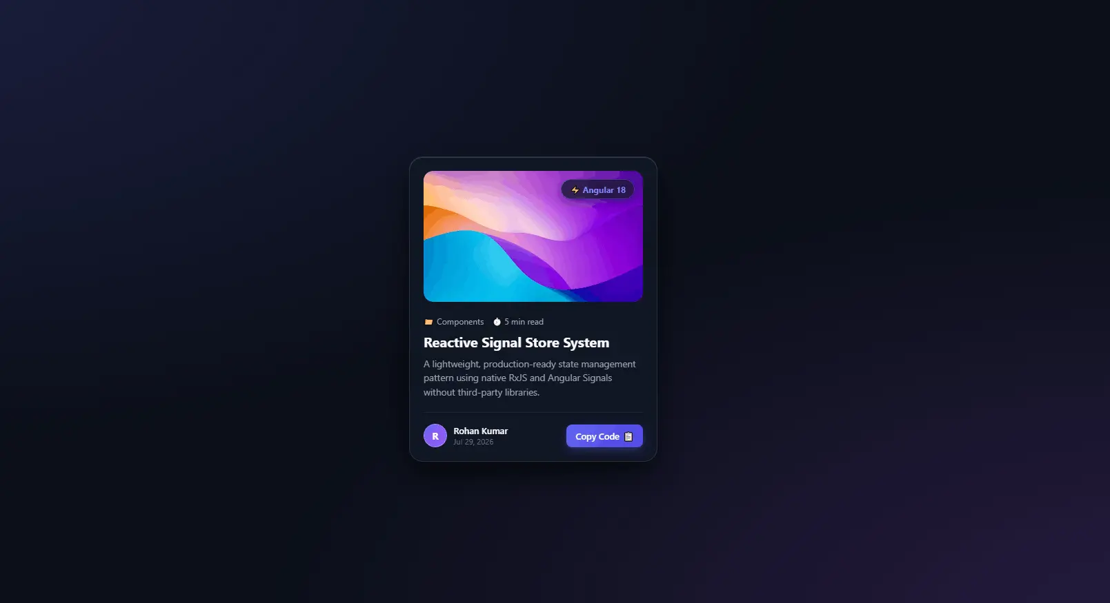
In this article, we will understand how to build a reusable GlassCard component in React with several interactive features, including a 3D tilt effect, dynamic glare, image presentation, author information, and a copy-code button.
1. Creating a Reusable React Component
The component is created inside GlassCard.jsx and receives its data through React props.
const GlassCard = ({
  image,
  badge,
  category,
  readTime,
  title,
  description,
  author,
  date,
  snippet,
}) => {
Instead of hardcoding values inside the component, properties such as title, description, author, and image are passed from the parent component.
This makes the component reusable. For example, the same GlassCard component can display a React article, Java article, JavaScript tutorial, or any other type of content simply by passing different props.
2. Using useRef() for DOM Manipulation
The component imports useRef from React:
import { useRef } from "react";
Three references are created:
const cardRef = useRef(null);
const glareRef = useRef(null);
const buttonRef = useRef(null);
useRef() allows us to maintain a reference to a DOM element without causing a React re-render when its value changes.
Here, the references are used for three purposes:
-
cardRef→ controls the card's 3D transformation. -
glareRef→ controls the dynamic glare effect. -
buttonRef→ changes the copy button's text and icon.
For example:
<div ref={cardRef} className="glass-card">
connects the React reference to the actual HTML element.
3. Creating the 3D Tilt Effect
One of the most interesting parts of this component is the mouse-based 3D tilt effect.
const handleMouseMove = (e) => {
Whenever the mouse moves over the card, the mouse coordinates are calculated relative to the card:
const rect = card.getBoundingClientRect();

const x = e.clientX - rect.left;
const y = e.clientY - rect.top;
The center of the card is then calculated:
const centerX = rect.width / 2;
const centerY = rect.height / 2;
The distance between the mouse position and the center determines how much the card should rotate.
const rotateX = ((y - centerY) / centerY) * -12;
const rotateY = ((x - centerX) / centerX) * 12;
Finally, the calculated values are applied using CSS transforms:
card.style.transform =
  `rotateX(${rotateX}deg) rotateY(${rotateY}deg)`;
This produces the illusion that the card is physically following the user's mouse.
4. Adding the Dynamic Glare Effect
The component also contains a separate element for the glare:
<div ref={glareRef} className="card-glare"></div>
During mouse movement, the glare position follows the cursor:
glare.style.background =
  `radial-gradient(
    circle at ${x}px ${y}px,
    rgba(255,255,255,.18),
    transparent 60%
  )`;
This creates a radial light effect around the mouse pointer.
The glare is initially hidden using:
.card-glare {
  opacity: 0;
}
and becomes visible when the mouse enters the card:
glare.style.opacity = "1";
When the mouse leaves, the card returns to its original position:
cardRef.current.style.transform =
  "rotateX(0deg) rotateY(0deg)";

glareRef.current.style.opacity = "0";
5. Creating the Glassmorphism Design
The visual appearance of the card is mainly created with CSS.
.glass-card {
  background: rgba(17, 24, 39, 0.7);
  backdrop-filter: blur(16px);
  border: 1px solid rgba(255, 255, 255, 0.1);
  border-radius: 20px;
}
The transparent background combined with backdrop-filter: blur() creates the glass-like effect.
The card also uses shadows:
box-shadow:
  0 20px 40px rgba(0, 0, 0, 0.6),
  inset 0 1px 0 rgba(255, 255, 255, 0.15);
This gives the card depth and separates it visually from the background.
The following property is particularly important for the 3D effect:
transform-style: preserve-3d;
It allows child elements to maintain their three-dimensional positioning.
For example:
.card-image-wrap {
  transform: translateZ(20px);
}

.card-content {
  transform: translateZ(30px);
}
These elements appear to move slightly closer to the user when the card tilts.
6. Making the Card Data-Driven
The component displays the values received through props:
<h2 className="card-title">{title}</h2>

<p className="card-description">
  {description}
</p>
The image is also dynamic:
<img src={image} alt={title} className="card-img" />
The badge, category, reading time, author, and date are also dynamically rendered.
This separation between data and presentation is one of the major advantages of React components.
7. Implementing the Copy Code Button
The card includes a button that copies the provided snippet to the clipboard.
await navigator.clipboard.writeText(snippet);
After copying the text, the button changes its appearance:
text.textContent = "Copied!";
icon.textContent = "✅";

btn.classList.add("copied");
After two seconds, it returns to its original state:
setTimeout(() => {
  text.textContent = "Copy Code";
  icon.textContent = "📋";
  btn.classList.remove("copied");
}, 2000);
The following line is also important:
e.stopPropagation();
It prevents the button click from propagating to parent elements that may have their own click handlers.
8. Using the Component in App.jsx
The component can now be used simply by providing its properties:
<GlassCard
  image="..."
  badge="⚡ React"
  category="📁 Components"
  readTime="⏱️ 5 min read"
  title="Reusable Glass Card"
  description="A reusable glassmorphism card component..."
  author="Rohan Kumar"
  date="Aug 5, 2026"
  snippet="npm install react"
/>
This demonstrates an important React principle: build once, reuse many times.
You could create multiple cards by simply changing the props:
<GlassCard
  title="Understanding useState"
  category="React"
  author="Rohan Kumar"
  ...
/>

<GlassCard
  title="Understanding useEffect"
  category="React"
  author="Rohan Kumar"
  ...
/>
No additional card component needs to be created.
Conclusion
This GlassCard component demonstrates several important React and frontend concepts in a single reusable UI component. It combines React props, useRef(), DOM manipulation, event handling, the Clipboard API, CSS 3D transforms, glassmorphism, gradients, transitions, and responsive UI design.
The biggest advantage of this approach is reusability. Instead of creating separate components for every article or tutorial, the same GlassCard can receive different data and display completely different content.
The component can also be extended further by adding features such as clickable cards, React Router navigation, favorite buttons, share buttons, loading states, responsive layouts, dark/light themes, and animations using libraries such as Framer Motion.
By combining React's component-based architecture with modern CSS effects, you can create interfaces that are both maintainable and visually engaging.