Slide Show Unsing HTML, CSS and Javascript
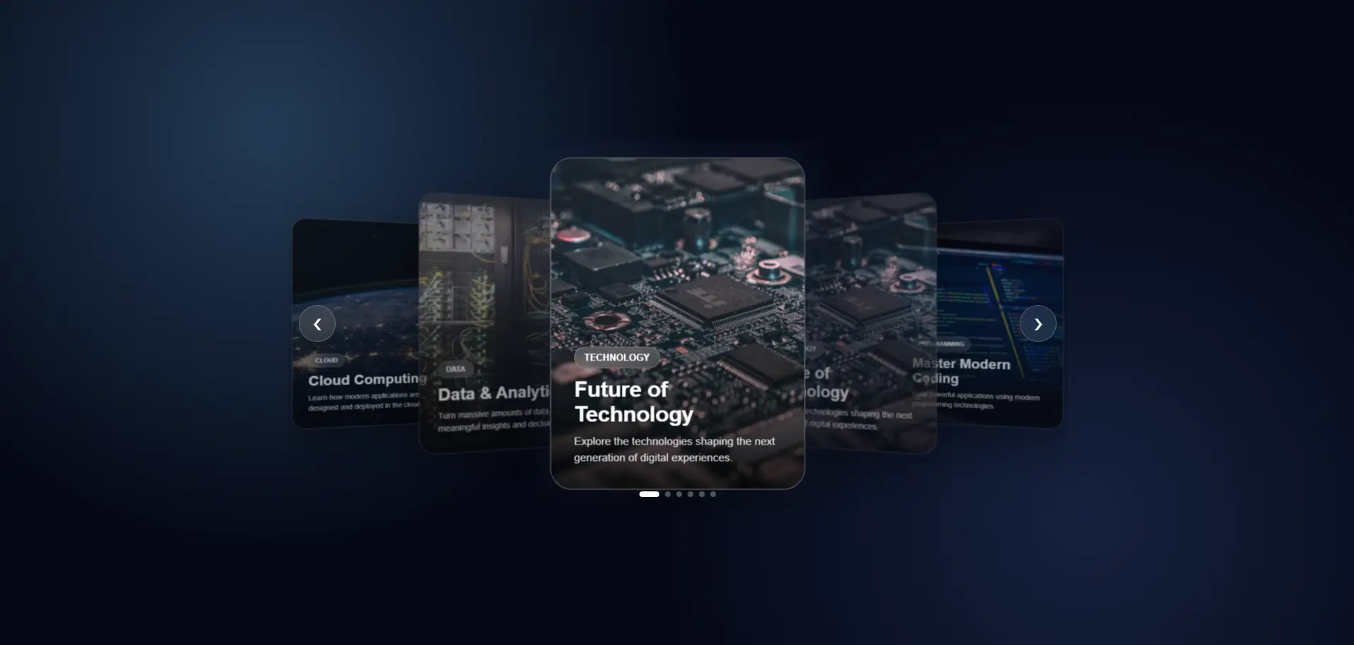
<!DOCTYPE html>
<html lang="en">
<head>
<meta charset="UTF-8" />
<meta name="viewport" content="width=device-width, initial-scale=1.0" />
<title>Next Gen Carousel</title>
<link rel="stylesheet" href="style.css">
</head>
<body>
<div class="carousel-wrapper">
<div class="carousel">
<!-- Cards -->
<article class="card">
<img
src="https://images.unsplash.com/photo-1518770660439-4636190af475?auto=format&fit=crop&w=800&q=80"
alt="Technology"
/>
<div class="card-content">
<span>TECHNOLOGY</span>
<h2>Future of Technology</h2>
<p>
Explore the technologies shaping the next generation of digital experiences.
</p>
</div>
</article>
<article class="card">
<img
src="https://images.unsplash.com/photo-1518770660439-4636190af475?auto=format&fit=crop&w=800&q=80"
alt="Technology"
/>
<div class="card-content">
<span>TECHNOLOGY</span>
<h2>Future of Technology</h2>
<p>
Explore the technologies shaping the next generation of digital experiences.
</p>
</div>
</article>
<article class="card">
<img
src="https://images.unsplash.com/photo-1555066931-4365d14bab8c?auto=format&fit=crop&w=800&q=80"
alt="Programming"
/>
<div class="card-content">
<span>PROGRAMMING</span>
<h2>Master Modern Coding</h2>
<p>
Build powerful applications using modern programming technologies.
</p>
</div>
</article>
<article class="card">
<img
src="https://images.unsplash.com/photo-1620712943543-bcc4688e7485?auto=format&fit=crop&w=800&q=80"
alt="Artificial Intelligence"
/>
<div class="card-content">
<span>AI</span>
<h2>Artificial Intelligence</h2>
<p>
Discover how AI is transforming software, business and everyday life.
</p>
</div>
</article>
<article class="card">
<img
src="https://images.unsplash.com/photo-1451187580459-43490279c0fa?auto=format&fit=crop&w=800&q=80"
alt="Cloud Computing"
/>
<div class="card-content">
<span>CLOUD</span>
<h2>Cloud Computing</h2>
<p>
Learn how modern applications are designed and deployed in the cloud.
</p>
</div>
</article>
<article class="card">
<img
src="https://images.unsplash.com/photo-1558494949-ef010cbdcc31?auto=format&fit=crop&w=800&q=80"
alt="Data"
/>
<div class="card-content">
<span>DATA</span>
<h2>Data & Analytics</h2>
<p>
Turn massive amounts of data into meaningful insights and decisions.
</p>
</div>
</article>
<!-- Navigation -->
<button class="nav prev" aria-label="Previous slide">❮</button>
<button class="nav next" aria-label="Next slide">❯</button>
<!-- Dots -->
<div class="dots"></div>
</div>
</div>
<script src="script.js"></script>
</body>
</html>* {
margin: 0;
padding: 0;
box-sizing: border-box;
}
body {
min-height: 100vh;
display: flex;
justify-content: center;
align-items: center;
font-family: Arial, sans-serif;
background:
radial-gradient(circle at 20% 20%, #243b55 0%, transparent 35%),
radial-gradient(circle at 80% 80%, #16213e 0%, transparent 35%),
#050816;
overflow: hidden;
}
.carousel-wrapper {
width: min(1100px, 95%);
position: relative;
}
.carousel {
position: relative;
height: 520px;
display: flex;
justify-content: center;
align-items: center;
perspective: 1200px;
overflow: hidden;
}
/* Cards */
.card {
position: absolute;
width: 330px;
height: 430px;
border-radius: 28px;
overflow: hidden;
background: rgba(255, 255, 255, 0.08);
border: 1px solid rgba(255, 255, 255, 0.15);
backdrop-filter: blur(18px);
-webkit-backdrop-filter: blur(18px);
box-shadow:
0 30px 80px rgba(0, 0, 0, 0.45),
inset 0 1px rgba(255, 255, 255, 0.15);
transition:
transform 0.7s cubic-bezier(.2, .8, .2, 1),
opacity 0.7s ease,
filter 0.7s ease;
cursor: pointer;
user-select: none;
}
.card img {
width: 100%;
height: 100%;
object-fit: cover;
}
.card::after {
content: "";
position: absolute;
inset: 0;
background:
linear-gradient(to top,
rgba(0, 0, 0, 0.85),
rgba(0, 0, 0, 0.05) 65%);
}
/* Card Content */
.card-content {
position: absolute;
z-index: 2;
bottom: 0;
left: 0;
right: 0;
padding: 30px;
color: white;
}
.card-content span {
display: inline-block;
padding: 6px 12px;
margin-bottom: 12px;
border-radius: 50px;
font-size: 12px;
font-weight: bold;
background: rgba(255, 255, 255, 0.15);
border: 1px solid rgba(255, 255, 255, 0.2);
backdrop-filter: blur(10px);
}
.card-content h2 {
font-size: 28px;
margin-bottom: 8px;
}
.card-content p {
font-size: 14px;
line-height: 1.5;
opacity: 0.8;
}
/* Active */
.card.active {
box-shadow:
0 40px 100px rgba(0, 0, 0, 0.6),
0 0 50px rgba(100, 150, 255, 0.15);
border-color: rgba(255, 255, 255, 0.3);
}
/* Navigation */
.nav {
position: absolute;
top: 50%;
transform: translateY(-50%);
width: 52px;
height: 52px;
border-radius: 50%;
border: 1px solid rgba(255, 255, 255, 0.2);
background: rgba(255, 255, 255, 0.08);
backdrop-filter: blur(15px);
color: white;
font-size: 22px;
cursor: pointer;
z-index: 20;
display: flex;
justify-content: center;
align-items: center;
transition: 0.3s ease;
}
.nav:hover {
background: rgba(255, 255, 255, 0.18);
transform: translateY(-50%) scale(1.1);
}
.prev {
left: 15px;
}
.next {
right: 15px;
}
/* Dots */
.dots {
position: absolute;
bottom: 15px;
left: 50%;
transform: translateX(-50%);
display: flex;
gap: 8px;
z-index: 30;
}
.dot {
width: 8px;
height: 8px;
border-radius: 50%;
border: none;
background: rgba(255, 255, 255, 0.3);
cursor: pointer;
transition: 0.3s ease;
}
.dot.active {
width: 28px;
border-radius: 20px;
background: white;
}
/* Mobile */
@media (max-width: 700px) {
.carousel {
height: 500px;
}
.card {
width: 270px;
height: 390px;
}
.nav {
width: 45px;
height: 45px;
}
.prev {
left: 5px;
}
.next {
right: 5px;
}
.card-content {
padding: 22px;
}
.card-content h2 {
font-size: 23px;
}
}
const cards = document.querySelectorAll(".card");
const dotsContainer = document.querySelector(".dots");
const nextButton = document.querySelector(".next");
const prevButton = document.querySelector(".prev");

let currentIndex = 0;

/*
  Create dots
*/
cards.forEach((_, index) => {
    const dot = document.createElement("button");
    dot.classList.add("dot");
    dot.addEventListener("click", () => {
        currentIndex = index;
        updateCarousel();
    });
    dotsContainer.appendChild(dot);
});

const dots = document.querySelectorAll(".dot");

/*
  Update carousel
*/
function updateCarousel() {
    const total = cards.length;

    cards.forEach((card, index) => {
        let offset = index - currentIndex;

        /*
          Handle circular positioning
        */
        if (offset > total / 2) {
            offset -= total;
        }
        if (offset < -total / 2) {
            offset += total;
        }

        /*
          Center card
        */
        if (offset === 0) {
            card.style.transform = "translateX(0) translateZ(100px) scale(1)";
            card.style.opacity = "1";
            card.style.filter = "none";
            card.style.zIndex = "10";
            card.classList.add("active");
        }
        /*
          Right cards
        */
        else if (offset > 0) {
            card.style.transform = `translateX(${offset * 240}px) translateZ(${-Math.abs(offset) * 80}px) rotateY(-25deg) scale(${1 - Math.abs(offset) * 0.12})`;
            card.style.opacity = Math.abs(offset) > 2 ? "0" : "0.65";
            card.style.filter = "blur(1px)";
            card.style.zIndex = `${5 - offset}`;
            card.classList.remove("active");
        }
        /*
          Left cards
        */
        else {
            card.style.transform = `translateX(${offset * 240}px) translateZ(${-Math.abs(offset) * 80}px) rotateY(25deg) scale(${1 - Math.abs(offset) * 0.12})`;
            card.style.opacity = Math.abs(offset) > 2 ? "0" : "0.65";
            card.style.filter = "blur(1px)";
            card.style.zIndex = `${5 - Math.abs(offset)}`;
            card.classList.remove("active");
        }
    });

    /*
      Update dots
    */
    dots.forEach((dot, index) => {
        dot.classList.toggle("active", index === currentIndex);
    });
}

/*
  Next
*/
nextButton.addEventListener("click", () => {
    currentIndex = (currentIndex + 1) % cards.length;
    // Moving Next: 0 -> 1 -> 2 -> 3 -> 4 -> 0
    updateCarousel();
});

/*
  Previous
*/
prevButton.addEventListener("click", () => {
    currentIndex = (currentIndex - 1 + cards.length) % cards.length;
    // Moving Prev: 0 -> 4 -> 3 -> 2 -> 1 -> 0
    updateCarousel();
});

/*
  Keyboard controls
*/
document.addEventListener("keydown", (event) => {
    if (event.key === "ArrowRight") {
        nextButton.click();
    }
    if (event.key === "ArrowLeft") {
        prevButton.click();
    }
});

/*
  Touch / Swipe support
*/
let touchStartX = 0;
let touchEndX = 0;

document.querySelector(".carousel").addEventListener("touchstart", (event) => {
    touchStartX = event.changedTouches[0].screenX;
});

document.querySelector(".carousel").addEventListener("touchend", (event) => {
    touchEndX = event.changedTouches[0].screenX;
    handleSwipe();
});

function handleSwipe() {
    const difference = touchStartX - touchEndX;

    if (Math.abs(difference) < 50) {
        return;
    }

    if (difference > 0) {
        nextButton.click();
    } else {
        prevButton.click();
    }
}

/*
  Autoplay
*/
let autoplay = setInterval(() => {
    currentIndex = (currentIndex + 1) % cards.length;
    updateCarousel();
}, 4500);

/*
  Pause autoplay while hovering
*/
const carousel = document.querySelector(".carousel");

carousel.addEventListener("mouseenter", () => clearInterval(autoplay));

carousel.addEventListener("mouseleave", () => {
    autoplay = setInterval(() => {
        currentIndex = (currentIndex + 1) % cards.length;
        updateCarousel();
    }, 4500);
});

/*
  Initialize
*/
updateCarousel();
Understanding the Next-Generation 3D Carousel
The uploaded code creates a modern, responsive, interactive 3D image carousel using only HTML, CSS, and JavaScript. The carousel contains multiple cards, places the currently selected card in the center, pushes the other cards to the left and right, and uses CSS 3D transforms to create a depth-based visual effect. It also supports navigation buttons, indicator dots, keyboard controls, touch/swipe gestures, and automatic sliding.
The most important thing to understand is that this carousel is not built by physically moving one container from left to right. Instead, every card is positioned relative to the currently active card. JavaScript calculates where each card should appear, while CSS handles the visual appearance and animation.
1. The Overall Structure
The code is divided into three major technologies:
-
HTML — creates the carousel structure and cards.
-
CSS — controls the design, positioning, 3D effect, animations, responsiveness, and visual appearance.
-
JavaScript — controls interaction and determines which card should currently be active.
The HTML document begins with the normal document structure:
<!DOCTYPE html>
<html lang="en">
<head>
The viewport meta tag is especially important for responsive websites:
<meta name="viewport" content="width=device-width, initial-scale=1.0" />
It tells mobile browsers to use the device's actual width instead of pretending that the page has a larger desktop-style viewport. The page title is:
<title>Next Gen Carousel</title>
The complete implementation is contained in a single HTML file, with the CSS inside <style> and JavaScript inside <script>.
2. Understanding the Body
The body contains the entire carousel:
<body>
  <div class="carousel-wrapper">
    <div class="carousel">
      ...
    </div>
  </div>
</body>
There are two important containers.
The first is:
.carousel-wrapper
and the second is:
.carousel
The wrapper mainly controls the overall width:
.carousel-wrapper {
  width: min(1100px, 95%);
  position: relative;
}
The interesting part here is:
width: min(1100px, 95%);
This means the wrapper will never become wider than 1100px, while on smaller screens it can use approximately 95% of the available width.
For example, on a large screen, the width may be capped at 1100px. On a smaller screen, 95% of the viewport can be used.
This is one of the reasons the carousel can work on different screen sizes.
3. The Main Carousel Container
The .carousel element is responsible for creating the stage where the cards are displayed:
.carousel {
  position: relative;
  height: 520px;
  display: flex;
  justify-content: center;
  align-items: center;
  perspective: 1200px;
  overflow: hidden;
}
Several properties are important here.
position: relative
This creates a positioning context for elements that use absolute positioning.
The cards themselves use:
position: absolute;
Therefore, they are positioned relative to the carousel.
display: flex
Flexbox is used to center the content.
justify-content: center;
align-items: center;
Both horizontally and vertically center the carousel's content.
perspective: 1200px
This is one of the most important properties for the 3D effect.
CSS transforms such as:
translateZ()
and:
rotateY()
can create a 3D effect, but the effect becomes much more realistic when a perspective is applied.
You can think of perspective as determining how strongly objects appear to become smaller as they move away from the viewer.
A lower perspective value generally produces a stronger 3D effect, while a higher value produces a more subtle effect.
overflow: hidden
Cards that move too far outside the carousel are hidden.
This prevents unwanted content from appearing outside the carousel area.
4. Understanding the Cards
Each carousel item is represented using an <article>:
<article class="card">
The cards are absolutely positioned:
.card {
  position: absolute;
  width: 330px;
  height: 430px;
}
This is very important.
If the cards were normal flex items, they would naturally appear beside each other. But this carousel needs the cards to overlap and occupy different depth positions.
Therefore, all cards are placed in the same general area and JavaScript later determines where each one should go.
The cards also have:
border-radius: 28px;
overflow: hidden;
The rounded corners are created by border-radius, while overflow: hidden ensures that the image does not extend beyond those rounded corners.
5. The Glassmorphism Design
One of the most visually interesting parts is the card background:
background: rgba(255, 255, 255, 0.08);
border: 1px solid rgba(255, 255, 255, 0.15);
backdrop-filter: blur(18px);
This creates a glass-like interface.
The first value:
rgba(255, 255, 255, 0.08)
means white with very low opacity.
The border is also slightly transparent.
Then:
backdrop-filter: blur(18px);
blurs whatever is behind the element.
Together, these properties produce a glassmorphism effect.
The code also includes:
-webkit-backdrop-filter: blur(18px);
This provides support for browsers that use the WebKit implementation of the property.
6. Card Animation
The cards contain:
transition:
  transform 0.7s cubic-bezier(.2,.8,.2,1),
  opacity 0.7s ease,
  filter 0.7s ease;
This is essential.
JavaScript changes properties such as:
transform
opacity
filter
But instead of changing instantly, CSS animates the changes over 0.7 seconds.
For example, if a card moves from the right side to the center, its transform changes. Because transform has a transition, the card smoothly moves rather than instantly jumping.
The custom cubic-bezier function:
cubic-bezier(.2,.8,.2,1)
controls the acceleration and deceleration of the animation.
7. Images Inside the Cards
Each card contains an image:
<img
  src="..."
  alt="Technology"
/>
The CSS ensures that the image fills the entire card:
.card img {
  width: 100%;
  height: 100%;
  object-fit: cover;
}
object-fit: cover is important because the image maintains its aspect ratio while completely covering the card.
Some parts of the image may therefore be cropped.
8. The Dark Gradient Overlay
The code uses a pseudo-element:
.card::after
to create a dark gradient over the image.
.card::after {
  content: "";
  position: absolute;
  inset: 0;
  background:
    linear-gradient(
      to top,
      rgba(0, 0, 0, 0.85),
      rgba(0, 0, 0, 0.05) 65%
    );
}
The purpose is not just visual decoration.
The dark region near the bottom makes the white text easier to read.
Because the gradient becomes much lighter toward the top, the original image remains visible there.
9. Card Content
Inside each card there is:
<div class="card-content">
  <span>TECHNOLOGY</span>
  <h2>Future of Technology</h2>
  <p>
    Explore the technologies shaping the next generation of digital experiences.
  </p>
</div>
The content is positioned at the bottom:
.card-content {
  position: absolute;
  bottom: 0;
  left: 0;
  right: 0;
  padding: 30px;
  color: white;
}
Because the card itself is positioned, the content can be placed directly over the image.
The category is styled like a small pill:
border-radius: 50px;
which gives it a rounded capsule appearance.
10. The Active Card
The carousel has a special class:
.card.active
The active card receives stronger visual treatment:
.card.active {
  box-shadow:
    0 40px 100px rgba(0, 0, 0, 0.6),
    0 0 50px rgba(100, 150, 255, 0.15);
  border-color: rgba(255,255,255,0.3);
}
But there is an important concept here:
JavaScript decides which card receives the active class.
CSS only defines what an active card looks like.
This separation is useful:
-
JavaScript = logic
-
CSS = appearance
11. Navigation Buttons
The carousel has two buttons:
<button class="nav prev">❮</button>
<button class="nav next">❯</button>
The first button represents previous, while the second represents next.
The CSS makes them circular:
width: 52px;
height: 52px;
border-radius: 50%;
They are positioned vertically in the center:
top: 50%;
transform: translateY(-50%);
The buttons also have a high:
z-index: 20;
so that they appear above the cards.
When the user hovers over a button:
.nav:hover {
  background: rgba(255,255,255,0.18);
  transform: translateY(-50%) scale(1.1);
}
it becomes slightly larger.
12. Indicator Dots
The HTML initially contains:
<div class="dots"></div>
There are no dots written manually.
Instead, JavaScript creates them dynamically.
This happens here:
cards.forEach((_, index) => {
  const dot = document.createElement("button");
  dot.classList.add("dot");
For every card, JavaScript creates one button.
If there are five cards, five dots are created.
This is better than manually creating five dots because if you add another card later, JavaScript automatically creates another dot.
13. The Most Important JavaScript Variable
The carousel uses:
let currentIndex = 0;
This variable represents the currently active card.
If:
currentIndex = 0;
the first card is active.
If:
currentIndex = 1;
the second card is active.
And so on.
This single variable is essentially the state of the carousel.
Whenever the user performs an action—clicking next, previous, a dot, using the keyboard, swiping, or waiting for autoplay—the code changes currentIndex and then calls:
updateCarousel();
14. Selecting the HTML Elements
At the beginning of the JavaScript:
const cards = document.querySelectorAll(".card");
const dotsContainer = document.querySelector(".dots");
const nextButton = document.querySelector(".next");
const prevButton = document.querySelector(".prev");
querySelectorAll(".card") retrieves all carousel cards.
The other three statements retrieve:
-
the dots container
-
next button
-
previous button
Now JavaScript can interact with those elements.
15. Creating the Dots
The code loops through every card:
cards.forEach((_, index) => {
The _ represents the actual card, but the code does not need it here.
The index gives the card's position.
A new button is created:
const dot = document.createElement("button");
Then:
dot.classList.add("dot");
adds the CSS class.
An event listener is attached:
dot.addEventListener("click", () => {
  currentIndex = index;
  updateCarousel();
});
This means clicking a dot directly changes the active card.
For example, clicking dot number 4 changes:
currentIndex = 3;
because JavaScript indexes arrays and NodeLists starting from zero.
16. The Heart of the Carousel: updateCarousel()
The most important function is:
function updateCarousel() {
Almost everything eventually calls this function.
First:
const total = cards.length;
gets the number of cards.
Then:
cards.forEach((card, index) => {
loops through every card.
The key calculation is:
let offset = index - currentIndex;
This determines where each card is relative to the active card.
Suppose there are five cards and:
currentIndex = 2;
Then:
| Card index | Calculation | Offset |
|---|---|---|
| 0 | 0 - 2 | -2 |
| 1 | 1 - 2 | -1 |
| 2 | 2 - 2 | 0 |
| 3 | 3 - 2 | 1 |
| 4 | 4 - 2 | 2 |
Therefore:
-
0= center -
positive = right
-
negative = left
This is the fundamental idea behind the carousel.
17. Circular Positioning
The carousel should behave like a loop.
For example:
0 → 1 → 2 → 3 → 4 → 0
The code handles this using:
if (offset > total / 2) {
  offset -= total;
}
and:
if (offset < -total / 2) {
  offset += total;
}
Imagine there are five cards and card 0 is active.
Card 4 technically has:
4 - 0 = 4
That would place it far to the right.
But visually, card 4 should actually be immediately to the left of card 0.
So the code converts:
4
into:
4 - 5 = -1
Now card 4 is treated as one position to the left.
This is what makes the carousel circular.
18. Positioning the Center Card
When:
offset === 0
the card is the active card.
The code applies:
translateX(0)
translateZ(100px)
scale(1)
So the active card:
-
stays in the center
-
moves forward in 3D space
-
remains full size
-
becomes fully visible
-
receives the active class
The code also sets:
card.style.opacity = "1";
card.style.filter = "none";
card.style.zIndex = "10";
This ensures the active card is the most prominent element.
19. Positioning the Right Cards
For cards where:
offset > 0
the code considers them right-side cards.
Their transform is:
translateX(${offset * 240}px)
translateZ(${-Math.abs(offset) * 80}px)
rotateY(-25deg)
scale(...)
This combination creates the 3D carousel appearance.
translateX() moves the card horizontally.
translateZ() moves it backward.
rotateY(-25deg) rotates it around the vertical axis.
scale() makes it smaller.
For example, the card immediately to the right receives approximately:
translateX(240px)
translateZ(-80px)
rotateY(-25deg)
scale(0.88)
So it looks smaller and farther away.
20. Positioning the Left Cards
The left side uses almost the same logic:
translateX(${offset * 240}px)
translateZ(${-Math.abs(offset) * 80}px)
rotateY(25deg)
The main difference is the rotation:
rotateY(25deg)
instead of:
rotateY(-25deg)
This makes the left cards angle toward the center from the opposite direction.
The cards also receive:
filter = "blur(1px)";
and:
opacity = "0.65";
which makes the center card visually dominant.
21. Why z-index Matters
The code dynamically changes:
card.style.zIndex
The center card receives:
10
while side cards receive smaller values.
This determines which card appears visually in front when cards overlap.
Without proper z-index values, cards could overlap in the wrong order.
22. Updating the Dots
After positioning the cards, the function updates the indicator dots:
dots.forEach((dot, index) => {
  dot.classList.toggle("active", index === currentIndex);
});
If the dot's index matches the current card index, it gets the active class.
The CSS changes an active dot from a small circle into a longer pill:
.dot.active {
  width: 28px;
  border-radius: 20px;
  background: white;
}
So the user can visually identify the currently selected slide.
23. Next Button Logic
The next button uses:
nextButton.addEventListener("click", () => {
  currentIndex = (currentIndex + 1) % cards.length;
  updateCarousel();
});
The important part is:
(currentIndex + 1) % cards.length
The modulo operator % makes the carousel circular.
Suppose there are five cards.
If the current index is:
0
the next index becomes:
1
Eventually:
4
becomes:
(4 + 1) % 5
= 5 % 5
= 0
So after the last card, the carousel automatically returns to the first card.
24. Previous Button Logic
The previous button uses:
currentIndex =
  (currentIndex - 1 + cards.length) % cards.length;
The + cards.length is important.
Without it, going backward from index 0 would produce -1.
With five cards:
(0 - 1 + 5) % 5
= 4 % 5
= 4
Therefore, pressing previous on the first card takes you to the last card.
This gives the carousel circular navigation in both directions.
25. Keyboard Navigation
The carousel also supports keyboard controls:
document.addEventListener("keydown", (event) => {
When the user presses the right arrow:
if (event.key === "ArrowRight") {
  nextButton.click();
}
the next button is triggered.
When the user presses the left arrow:
if (event.key === "ArrowLeft") {
  prevButton.click();
}
the previous button is triggered.
This is a nice example of code reuse.
Instead of writing separate carousel logic for the keyboard, the code simply triggers the existing navigation buttons.
26. Touch and Swipe Support
The carousel also supports mobile gestures.
Two variables store the starting and ending positions:
let touchStartX = 0;
let touchEndX = 0;
When the user touches the carousel:
touchStartX = event.changedTouches[0].screenX;
the starting X coordinate is stored.
When the touch ends:
touchEndX = event.changedTouches[0].screenX;
the ending position is stored.
Then:
handleSwipe();
is called.
27. Understanding Swipe Detection
The code calculates:
const difference = touchStartX - touchEndX;
Suppose the user swipes from left to right.
The starting X coordinate could be:
200
and ending X:
500
Therefore:
200 - 500 = -300
The difference is negative.
The code interprets this as a previous action:
else {
  prevButton.click();
}
If the user swipes from right to left, the difference becomes positive, so:
nextButton.click();
is triggered.
The code also ignores very small movements:
if (Math.abs(difference) < 50) {
  return;
}
This prevents a tiny accidental touch movement from changing the slide.
28. Autoplay
The carousel can automatically move to the next card.
This is handled using:
let autoplay = setInterval(() => {
  currentIndex = (currentIndex + 1) % cards.length;
  updateCarousel();
}, 4500);
setInterval() repeatedly executes the function.
The interval is:
4500 milliseconds
which equals:
4.5 seconds
So approximately every 4.5 seconds, the carousel moves to the next card.
29. Pausing on Hover
Automatically moving carousels can be annoying if the user is trying to read the content.
The code solves this by pausing autoplay when the mouse enters:
carousel.addEventListener("mouseenter", () =>
  clearInterval(autoplay)
);
When the mouse leaves:
carousel.addEventListener("mouseleave", () => {
autoplay is started again.
This improves usability because users can hover over the carousel and read the card without it immediately changing.
30. Initialization
Finally:
updateCarousel();
is called.
This is essential.
The browser initially loads the cards, but JavaScript has not yet assigned their positions.
Calling updateCarousel() immediately establishes the initial state:
currentIndex = 0
Therefore, the first card becomes the center card, the appropriate cards appear on the sides, and the first dot becomes active.
31. Responsive Design
The code includes a media query:
@media (max-width: 700px)
Inside it, the carousel becomes smaller.
The card changes from:
330px × 430px
to:
270px × 390px
The navigation buttons also shrink:
52px → 45px
The content padding decreases, and the heading becomes smaller.
This prevents the desktop design from becoming too large on mobile screens.
32. The Complete Flow
The easiest way to understand the entire application is to follow one interaction.
Imagine the first card is active:
currentIndex = 0
The user clicks the Next button.
The event listener executes:
currentIndex = (currentIndex + 1) % cards.length;
So:
0 → 1
Then:
updateCarousel();
runs.
Inside that function, every card gets a new offset.
The old active card now becomes a left-side card.
The second card gets:
offset = 0
so it becomes the center card.
CSS transforms are updated.
Because CSS transitions are enabled, the cards smoothly animate into their new positions.
The dot indicator is updated as well.
This is the central mechanism behind the entire carousel.
33. Why This Approach Is Powerful
The code separates state, calculation, and presentation.
The state is:
currentIndex
The calculation happens inside:
updateCarousel()
The presentation is handled by CSS.
This makes the carousel easier to understand and modify.
For example, if you want the cards to move farther apart, you can change:
offset * 240
to something like:
offset * 300
If you want stronger depth, you can modify:
offset * 80
If you want stronger rotation, change:
rotateY(-25deg)
and:
rotateY(25deg)
If you want slower animations, change:
0.7s
to:
1s
34. What You Should Remember
There are five concepts you should understand particularly well if you want to build similar components yourself.
1. currentIndex
This tells the program which card is currently active.
2. offset
This tells the program how far each card is from the active card.
let offset = index - currentIndex;
3. CSS transform
The transform creates the actual visual movement:
translateX()
translateZ()
rotateY()
scale()
4. Modulo %
Modulo makes navigation circular:
(currentIndex + 1) % cards.length
and:
(currentIndex - 1 + cards.length) % cards.length
5. updateCarousel()
This function connects everything together.
Whenever the active index changes, updateCarousel() recalculates the position and appearance of every card.
Conclusion
This carousel is a good example of how HTML, CSS, and JavaScript work together to create an interactive UI component.
HTML defines the cards, images, content, navigation buttons, and dots. The cards themselves contain technology, programming, AI, cloud, and data-related content.
CSS creates the visual experience using glassmorphism, gradients, shadows, responsive sizing, transitions, and 3D transforms. The most important CSS concept is transform, because translateX(), translateZ(), rotateY(), and scale() are responsible for making the cards appear to exist at different positions and depths.
JavaScript provides the intelligence. It keeps track of the active card using currentIndex, calculates each card's relative offset, handles circular positioning, updates the dots, and responds to buttons, keyboard arrows, touch gestures, and autoplay.
The key mental model is simple:
User interaction
       ↓
Change currentIndex
       ↓
updateCarousel()
       ↓
Calculate offset for every card
       ↓
Apply transform / opacity / filter / z-index
       ↓
CSS transition animates the changes
       ↓
New card becomes the center
Once you understand this flow, the code becomes much easier to read. You are no longer looking at hundreds of lines of HTML, CSS, and JavaScript as one large program. Instead, you can divide it into small responsibilities: HTML creates the content, CSS creates the visual design, and JavaScript controls the state and behavior.
That architecture is also the reason this component can be extended easily with features such as different animation styles, more cards, clickable cards, dynamic data, loading content from an API, custom autoplay controls, or additional keyboard and accessibility features.