🔍
R
Rohan Kumar
Posted on Aug 26, 2026 • HTML / CSS / JAVASCRIPT

Slide Show Using HTML, CSS and Javascript
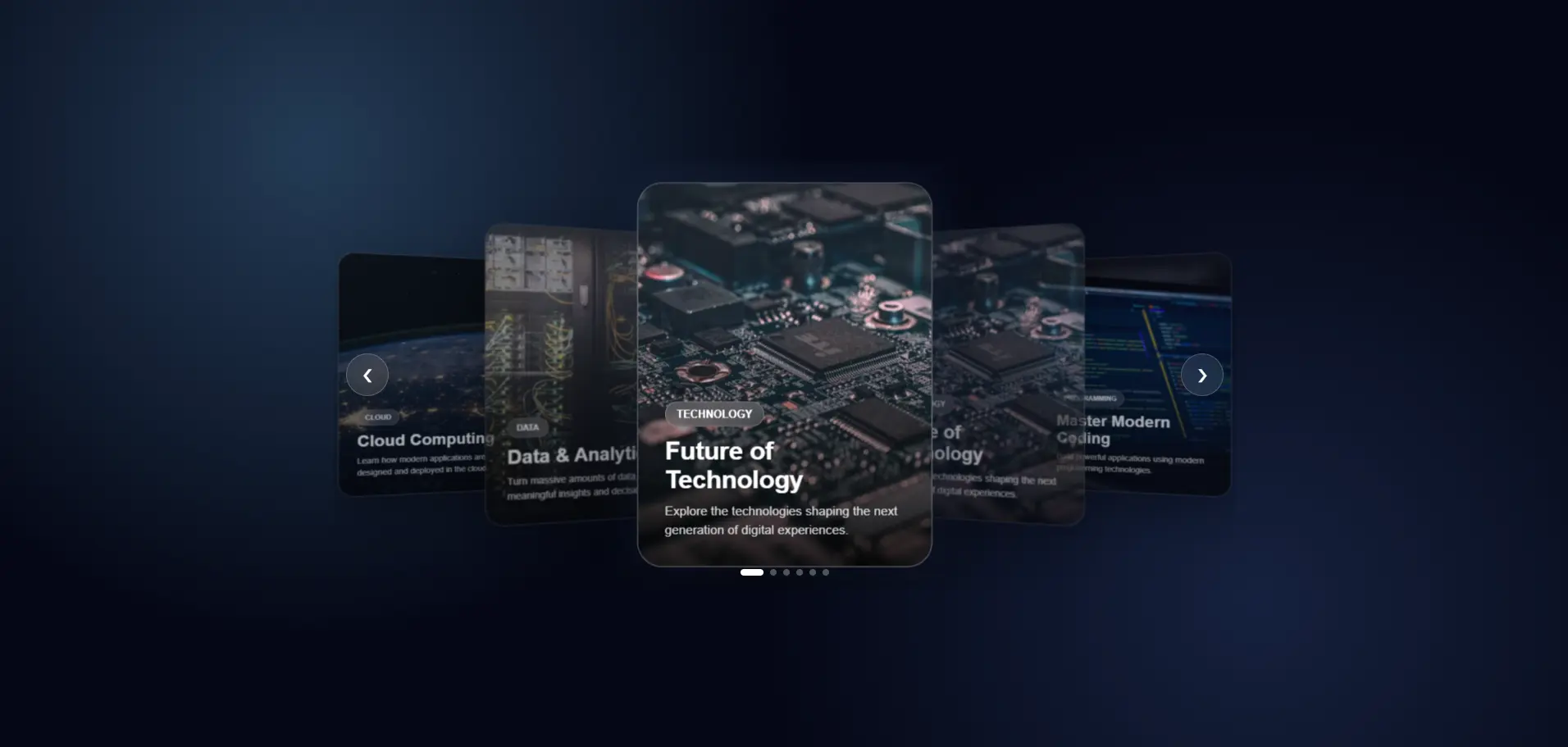
<!DOCTYPE html>
<html lang="en">
<head>
  <meta charset="UTF-8" />
  <meta name="viewport" content="width=device-width, initial-scale=1.0" />
  <title>Next Gen Carousel</title>
  <link rel="stylesheet" href="style.css">
</head>

<body>

  <div class="carousel-wrapper">
    <div class="carousel">

      <!-- Cards -->
      <article class="card">
        <img
          src="https://images.unsplash.com/photo-1518770660439-4636190af475?auto=format&fit=crop&w=800&q=80"
          alt="Technology"
        />
        <div class="card-content">
          <span>TECHNOLOGY</span>
          <h2>Future of Technology</h2>
          <p>
            Explore the technologies shaping the next generation of digital experiences.
          </p>
        </div>
      </article>
      <article class="card">
        <img
          src="https://images.unsplash.com/photo-1518770660439-4636190af475?auto=format&fit=crop&w=800&q=80"
          alt="Technology"
        />
        <div class="card-content">
          <span>TECHNOLOGY</span>
          <h2>Future of Technology</h2>
          <p>
            Explore the technologies shaping the next generation of digital experiences.
          </p>
        </div>
      </article>

      <article class="card">
        <img
          src="https://images.unsplash.com/photo-1555066931-4365d14bab8c?auto=format&fit=crop&w=800&q=80"
          alt="Programming"
        />
        <div class="card-content">
          <span>PROGRAMMING</span>
          <h2>Master Modern Coding</h2>
          <p>
            Build powerful applications using modern programming technologies.
          </p>
        </div>
      </article>

      <article class="card">
        <img
          src="https://images.unsplash.com/photo-1620712943543-bcc4688e7485?auto=format&fit=crop&w=800&q=80"
          alt="Artificial Intelligence"
        />
        <div class="card-content">
          <span>AI</span>
          <h2>Artificial Intelligence</h2>
          <p>
            Discover how AI is transforming software, business and everyday life.
          </p>
        </div>
      </article>

      <article class="card">
        <img
          src="https://images.unsplash.com/photo-1451187580459-43490279c0fa?auto=format&fit=crop&w=800&q=80"
          alt="Cloud Computing"
        />
        <div class="card-content">
          <span>CLOUD</span>
          <h2>Cloud Computing</h2>
          <p>
            Learn how modern applications are designed and deployed in the cloud.
          </p>
        </div>
      </article>

      <article class="card">
        <img
          src="https://images.unsplash.com/photo-1558494949-ef010cbdcc31?auto=format&fit=crop&w=800&q=80"
          alt="Data"
        />
        <div class="card-content">
          <span>DATA</span>
          <h2>Data & Analytics</h2>
          <p>
            Turn massive amounts of data into meaningful insights and decisions.
          </p>
        </div>
      </article>

      <!-- Navigation -->
      <button class="nav prev" aria-label="Previous slide">&#10094;</button>
      <button class="nav next" aria-label="Next slide">&#10095;</button>

      <!-- Dots -->
      <div class="dots"></div>

    </div>
  </div>

  <script src="script.js"></script>

</body>
</html>
* {
    margin: 0;
    padding: 0;
    box-sizing: border-box;
}

body {
    min-height: 100vh;
    display: flex;
    justify-content: center;
    align-items: center;
    font-family: Arial, sans-serif;
    background:
        radial-gradient(circle at 20% 20%, #243b55 0%, transparent 35%),
        radial-gradient(circle at 80% 80%, #16213e 0%, transparent 35%),
        #050816;
    overflow: hidden;
}

.carousel-wrapper {
    width: min(1100px, 95%);
    position: relative;
}

.carousel {
    position: relative;
    height: 520px;
    display: flex;
    justify-content: center;
    align-items: center;
    perspective: 1200px;
    overflow: hidden;
}

/* Cards */
.card {
    position: absolute;
    width: 330px;
    height: 430px;
    border-radius: 28px;
    overflow: hidden;
    background: rgba(255, 255, 255, 0.08);
    border: 1px solid rgba(255, 255, 255, 0.15);
    backdrop-filter: blur(18px);
    -webkit-backdrop-filter: blur(18px);
    box-shadow:
        0 30px 80px rgba(0, 0, 0, 0.45),
        inset 0 1px rgba(255, 255, 255, 0.15);
    transition:
        transform 0.7s cubic-bezier(.2, .8, .2, 1),
        opacity 0.7s ease,
        filter 0.7s ease;
    cursor: pointer;
    user-select: none;
}

.card img {
    width: 100%;
    height: 100%;
    object-fit: cover;
}

.card::after {
    content: "";
    position: absolute;
    inset: 0;
    background:
        linear-gradient(to top,
            rgba(0, 0, 0, 0.85),
            rgba(0, 0, 0, 0.05) 65%);
}

/* Card Content */
.card-content {
    position: absolute;
    z-index: 2;
    bottom: 0;
    left: 0;
    right: 0;
    padding: 30px;
    color: white;
}

.card-content span {
    display: inline-block;
    padding: 6px 12px;
    margin-bottom: 12px;
    border-radius: 50px;
    font-size: 12px;
    font-weight: bold;
    background: rgba(255, 255, 255, 0.15);
    border: 1px solid rgba(255, 255, 255, 0.2);
    backdrop-filter: blur(10px);
}

.card-content h2 {
    font-size: 28px;
    margin-bottom: 8px;
}

.card-content p {
    font-size: 14px;
    line-height: 1.5;
    opacity: 0.8;
}

/* Active */
.card.active {
    box-shadow:
        0 40px 100px rgba(0, 0, 0, 0.6),
        0 0 50px rgba(100, 150, 255, 0.15);
    border-color: rgba(255, 255, 255, 0.3);
}

/* Navigation */
.nav {
    position: absolute;
    top: 50%;
    transform: translateY(-50%);
    width: 52px;
    height: 52px;
    border-radius: 50%;
    border: 1px solid rgba(255, 255, 255, 0.2);
    background: rgba(255, 255, 255, 0.08);
    backdrop-filter: blur(15px);
    color: white;
    font-size: 22px;
    cursor: pointer;
    z-index: 20;
    display: flex;
    justify-content: center;
    align-items: center;
    transition: 0.3s ease;
}

.nav:hover {
    background: rgba(255, 255, 255, 0.18);
    transform: translateY(-50%) scale(1.1);
}

.prev {
    left: 15px;
}

.next {
    right: 15px;
}

/* Dots */
.dots {
    position: absolute;
    bottom: 15px;
    left: 50%;
    transform: translateX(-50%);
    display: flex;
    gap: 8px;
    z-index: 30;
}

.dot {
    width: 8px;
    height: 8px;
    border-radius: 50%;
    border: none;
    background: rgba(255, 255, 255, 0.3);
    cursor: pointer;
    transition: 0.3s ease;
}

.dot.active {
    width: 28px;
    border-radius: 20px;
    background: white;
}

/* Mobile */
@media (max-width: 700px) {
    .carousel {
        height: 500px;
    }

    .card {
        width: 270px;
        height: 390px;
    }

    .nav {
        width: 45px;
        height: 45px;
    }

    .prev {
        left: 5px;
    }

    .next {
        right: 5px;
    }

    .card-content {
        padding: 22px;
    }

    .card-content h2 {
        font-size: 23px;
    }
}
const cards = document.querySelectorAll(".card");
const dotsContainer = document.querySelector(".dots");
const nextButton = document.querySelector(".next");
const prevButton = document.querySelector(".prev");

let currentIndex = 0;

/*
  Create dots
*/
cards.forEach((_, index) => {
    const dot = document.createElement("button");
    dot.classList.add("dot");
    dot.addEventListener("click", () => {
        currentIndex = index;
        updateCarousel();
    });
    dotsContainer.appendChild(dot);
});

const dots = document.querySelectorAll(".dot");

/*
  Update carousel
*/
function updateCarousel() {
    const total = cards.length;

    cards.forEach((card, index) => {
        let offset = index - currentIndex;

        /*
          Handle circular positioning
        */
        if (offset > total / 2) {
            offset -= total;
        }
        if (offset < -total / 2) {
            offset += total;
        }

        /*
          Center card
        */
        if (offset === 0) {
            card.style.transform = "translateX(0) translateZ(100px) scale(1)";
            card.style.opacity = "1";
            card.style.filter = "none";
            card.style.zIndex = "10";
            card.classList.add("active");
        }
        /*
          Right cards
        */
        else if (offset > 0) {
            card.style.transform = `translateX(${offset * 240}px) translateZ(${-Math.abs(offset) * 80}px) rotateY(-25deg) scale(${1 - Math.abs(offset) * 0.12})`;
            card.style.opacity = Math.abs(offset) > 2 ? "0" : "0.65";
            card.style.filter = "blur(1px)";
            card.style.zIndex = `${5 - offset}`;
            card.classList.remove("active");
        }
        /*
          Left cards
        */
        else {
            card.style.transform = `translateX(${offset * 240}px) translateZ(${-Math.abs(offset) * 80}px) rotateY(25deg) scale(${1 - Math.abs(offset) * 0.12})`;
            card.style.opacity = Math.abs(offset) > 2 ? "0" : "0.65";
            card.style.filter = "blur(1px)";
            card.style.zIndex = `${5 - Math.abs(offset)}`;
            card.classList.remove("active");
        }
    });

    /*
      Update dots
    */
    dots.forEach((dot, index) => {
        dot.classList.toggle("active", index === currentIndex);
    });
}

/*
  Next
*/
nextButton.addEventListener("click", () => {
    currentIndex = (currentIndex + 1) % cards.length;
    // Moving Next: 0 -> 1 -> 2 -> 3 -> 4 -> 0
    updateCarousel();
});

/*
  Previous
*/
prevButton.addEventListener("click", () => {
    currentIndex = (currentIndex - 1 + cards.length) % cards.length;
    // Moving Prev: 0 -> 4 -> 3 -> 2 -> 1 -> 0
    updateCarousel();
});

/*
  Keyboard controls
*/
document.addEventListener("keydown", (event) => {
    if (event.key === "ArrowRight") {
        nextButton.click();
    }
    if (event.key === "ArrowLeft") {
        prevButton.click();
    }
});

/*
  Touch / Swipe support
*/
let touchStartX = 0;
let touchEndX = 0;

document.querySelector(".carousel").addEventListener("touchstart", (event) => {
    touchStartX = event.changedTouches[0].screenX;
});

document.querySelector(".carousel").addEventListener("touchend", (event) => {
    touchEndX = event.changedTouches[0].screenX;
    handleSwipe();
});

function handleSwipe() {
    const difference = touchStartX - touchEndX;

    if (Math.abs(difference) < 50) {
        return;
    }

    if (difference > 0) {
        nextButton.click();
    } else {
        prevButton.click();
    }
}

/*
  Autoplay
*/
let autoplay = setInterval(() => {
    currentIndex = (currentIndex + 1) % cards.length;
    updateCarousel();
}, 4500);

/*
  Pause autoplay while hovering
*/
const carousel = document.querySelector(".carousel");

carousel.addEventListener("mouseenter", () => clearInterval(autoplay));

carousel.addEventListener("mouseleave", () => {
    autoplay = setInterval(() => {
        currentIndex = (currentIndex + 1) % cards.length;
        updateCarousel();
    }, 4500);
});

/*
  Initialize
*/
updateCarousel();

Understanding the Next-Generation 3D Carousel The uploaded code creates a modern, responsive, interactive 3D image carousel using only HTML, CSS, and JavaScript. The carousel contains multiple cards, places the cur...

Read Full Documentation →
R
Rohan Kumar
Posted on Jul 29, 2026 • HTML / CSS / JAVASCRIPT

3D Tilt Glassmorphism Card with Interactive Glare & Copy Snippet

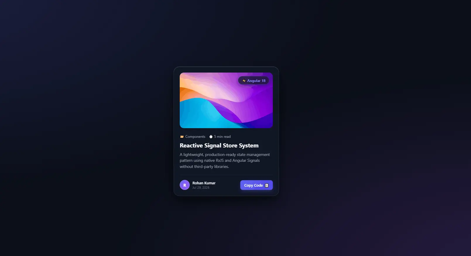
<div class="card-container">
        <div class="glass-card" id="tiltCard">
            <!-- Dynamic Glare Highlight Overlay -->
            <div class="card-glare"></div>

            <div class="card-image-wrap">
                <img src="https://images.unsplash.com/photo-1618005182384-a83a8bd57fbe?w=600&auto=format&fit=crop&q=80" alt="Abstract Art" class="card-img">
                <span class="badge-tag">⚡ Angular 18</span>
            </div>

            <div class="card-content">
                <div class="card-meta">
                    <span class="meta-item">📁 Components</span>
                    <span class="meta-item">⏱️ 5 min read</span>
                </div>

                <h2 class="card-title">Reactive Signal Store System</h2>
                <p class="card-description">
                    A lightweight, production-ready state management pattern using native RxJS and Angular Signals without third-party libraries.
                </p>

                <div class="card-footer">
                    <div class="author-info">
                        <div class="author-avatar">R</div>
                        <div>
                            <div class="author-name">Rohan Kumar</div>
                            <div class="post-date">Jul 29, 2026</div>
                        </div>
                    </div>

                    <button class="btn-copy" id="copyBtn" data-snippet="npm i @angular/core@next">
                        <span class="btn-text">Copy Code</span>
                        <span class="btn-icon">📋</span>
                    </button>
                </div>
            </div>
        </div>
    </div>
/* ========================================================
   GLOBAL RESETS & GLASSLAND BACKGROUND
   ======================================================== */
* {
    margin: 0;
    padding: 0;
    box-sizing: border-box;
    font-family: 'Segoe UI', system-ui, -apple-system, sans-serif;
}

body {
    min-height: 100vh;
    display: flex;
    justify-content: center;
    align-items: center;
    background: #0B0F19;
    background-image: 
        radial-gradient(at 0% 0%, rgba(99, 102, 241, 0.18) 0px, transparent 50%),
        radial-gradient(at 100% 100%, rgba(168, 85, 247, 0.18) 0px, transparent 50%);
    overflow: hidden;
    padding: 1.5rem;
}

/* Container for 3D perspective field */
.card-container {
    perspective: 1000px;
}

/* ========================================================
   STYLISH GLASS CARD
   ======================================================== */
.glass-card {
    width: 360px;
    background: rgba(17, 24, 39, 0.7);
    backdrop-filter: blur(16px);
    -webkit-backdrop-filter: blur(16px);
    border: 1px solid rgba(255, 255, 255, 0.1);
    border-radius: 20px;
    padding: 1.25rem;
    box-shadow: 
        0 20px 40px rgba(0, 0, 0, 0.6),
        inset 0 1px 0 rgba(255, 255, 255, 0.15);
    position: relative;
    overflow: hidden;
    transform-style: preserve-3d;
    transition: transform 0.15s ease-out, box-shadow 0.3s ease;
    cursor: pointer;
}

.glass-card:hover {
    box-shadow: 
        0 30px 60px rgba(0, 0, 0, 0.8),
        0 0 30px rgba(99, 102, 241, 0.25),
        inset 0 1px 0 rgba(255, 255, 255, 0.25);
}

/* Dynamic Glare Effect Overlay */
.card-glare {
    position: absolute;
    top: 0;
    left: 0;
    width: 100%;
    height: 100%;
    pointer-events: none;
    background: radial-gradient(circle at 50% 50%, rgba(255, 255, 255, 0.15), transparent 60%);
    opacity: 0;
    transition: opacity 0.3s ease;
    z-index: 5;
}

/* ========================================================
   CARD MEDIA & BADGE
   ======================================================== */
.card-image-wrap {
    position: relative;
    width: 100%;
    height: 190px;
    border-radius: 14px;
    overflow: hidden;
    transform: translateZ(20px); /* Lift element in 3D space */
}

.card-img {
    width: 100%;
    height: 100%;
    object-fit: cover;
    transition: transform 0.5s cubic-bezier(0.4, 0, 0.2, 1);
}

.glass-card:hover .card-img {
    transform: scale(1.08);
}

.badge-tag {
    position: absolute;
    top: 12px;
    right: 12px;
    background: rgba(17, 24, 39, 0.75);
    backdrop-filter: blur(8px);
    color: #818CF8;
    font-size: 0.75rem;
    font-weight: 700;
    padding: 0.35rem 0.75rem;
    border-radius: 50px;
    border: 1px solid rgba(99, 102, 241, 0.4);
    box-shadow: 0 4px 12px rgba(0, 0, 0, 0.3);
}

/* ========================================================
   CARD TYPOGRAPHY & BODY
   ======================================================== */
.card-content {
    margin-top: 1.25rem;
    transform: translateZ(30px); /* Deeper 3D depth */
}

.card-meta {
    display: flex;
    gap: 0.75rem;
    font-size: 0.75rem;
    color: #9CA3AF;
    margin-bottom: 0.5rem;
}

.card-title {
    color: #F9FAFB;
    font-size: 1.25rem;
    font-weight: 700;
    line-height: 1.35;
    margin-bottom: 0.5rem;
    transition: color 0.2s ease;
}

.glass-card:hover .card-title {
    color: #818CF8;
}

.card-description {
    color: #9CA3AF;
    font-size: 0.85rem;
    line-height: 1.5;
    margin-bottom: 1.25rem;
    display: -webkit-box;
    -webkit-line-clamp: 3;
    -webkit-box-orient: vertical;
    overflow: hidden;
}

/* ========================================================
   FOOTER & INTERACTIVE BUTTON
   ======================================================== */
.card-footer {
    display: flex;
    align-items: center;
    justify-content: space-between;
    padding-top: 1rem;
    border-top: 1px solid rgba(255, 255, 255, 0.08);
    transform: translateZ(25px);
}

.author-info {
    display: flex;
    align-items: center;
    gap: 0.6rem;
}

.author-avatar {
    width: 34px;
    height: 34px;
    border-radius: 50%;
    background: linear-gradient(135deg, #6366F1, #A855F7);
    color: #ffffff;
    font-weight: 700;
    font-size: 0.85rem;
    display: flex;
    align-items: center;
    justify-content: center;
    border: 1px solid rgba(255, 255, 255, 0.2);
}

.author-name {
    color: #F9FAFB;
    font-size: 0.8rem;
    font-weight: 600;
}

.post-date {
    color: #6B7280;
    font-size: 0.7rem;
}

.btn-copy {
    background: linear-gradient(135deg, #6366F1, #4F46E5);
    color: #ffffff;
    border: none;
    border-radius: 8px;
    padding: 0.5rem 0.85rem;
    font-size: 0.8rem;
    font-weight: 600;
    cursor: pointer;
    display: flex;
    align-items: center;
    gap: 0.35rem;
    transition: all 0.2s cubic-bezier(0.4, 0, 0.2, 1);
    box-shadow: 0 4px 12px rgba(99, 102, 241, 0.3);
}

.btn-copy:hover {
    transform: translateY(-2px);
    box-shadow: 0 6px 16px rgba(99, 102, 241, 0.5);
}

.btn-copy:active {
    transform: translateY(0);
}

.btn-copy.copied {
    background: #10B981;
    box-shadow: 0 4px 12px rgba(16, 185, 129, 0.4);
}
document.addEventListener('DOMContentLoaded', () => {
    const card = document.getElementById('tiltCard');
    const glare = card.querySelector('.card-glare');
    const copyBtn = document.getElementById('copyBtn');

    /* ========================================================
       1. 3D MOUSE TILT & GLARE EFFECT
       ======================================================== */
    card.addEventListener('mousemove', (e) => {
        const rect = card.getBoundingClientRect();
        
        // Calculate mouse position relative to card center (-1 to 1)
        const x = e.clientX - rect.left;
        const y = e.clientY - rect.top;
        
        const centerX = rect.width / 2;
        const centerY = rect.height / 2;
        
        const rotateX = ((y - centerY) / centerY) * -12; // Max 12deg tilt
        const rotateY = ((x - centerX) / centerX) * 12;

        // Apply 3D rotation transform
        card.style.transform = `rotateX(${rotateX}deg) rotateY(${rotateY}deg)`;

        // Adjust dynamic glare position & intensity
        glare.style.opacity = '1';
        glare.style.background = `radial-gradient(circle at ${x}px ${y}px, rgba(255, 255, 255, 0.18), transparent 60%)`;
    });

    // Reset card tilt when mouse leaves
    card.addEventListener('mouseleave', () => {
        card.style.transform = 'rotateX(0deg) rotateY(0deg)';
        glare.style.opacity = '0';
    });

    /* ========================================================
       2. INTERACTIVE COPY TO CLIPBOARD BUTTON
       ======================================================== */
    copyBtn.addEventListener('click', (e) => {
        e.stopPropagation(); // Prevent card triggers
        
        const textToCopy = copyBtn.getAttribute('data-snippet');
        
        navigator.clipboard.writeText(textToCopy).then(() => {
            const btnText = copyBtn.querySelector('.btn-text');
            const btnIcon = copyBtn.querySelector('.btn-icon');
            
            // Visual feedback update
            btnText.textContent = 'Copied!';
            btnIcon.textContent = '✅';
            copyBtn.classList.add('copied');

            // Reset back after 2 seconds
            setTimeout(() => {
                btnText.textContent = 'Copy Code';
                btnIcon.textContent = '📋';
                copyBtn.classList.remove('copied');
            }, 2000);
        }).catch(err => {
            console.error('Failed to copy text: ', err);
        });
    });
});
🔖 Bookmark saved successfully!