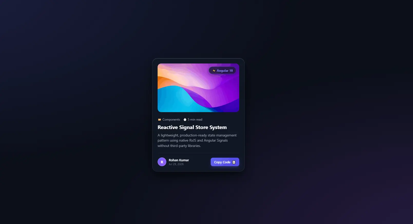
Interactive 3D Glassmorphism Card Component in React | Tilt Effect & Copy Button
import { useRef } from "react";
import "./GlassCard.css";

const GlassCard = ({
  image,
  badge,
  category,
  readTime,
  title,
  description,
  author,
  date,
  snippet,
}) => {
  const cardRef = useRef(null);
  const glareRef = useRef(null);
  const buttonRef = useRef(null);

  const handleMouseMove = (e) => {
    const card = cardRef.current;
    const glare = glareRef.current;

    const rect = card.getBoundingClientRect();

    const x = e.clientX - rect.left;
    const y = e.clientY - rect.top;

    const centerX = rect.width / 2;
    const centerY = rect.height / 2;

    const rotateX = ((y - centerY) / centerY) * -12;
    const rotateY = ((x - centerX) / centerX) * 12;

    card.style.transform = `rotateX(${rotateX}deg) rotateY(${rotateY}deg)`;

    glare.style.opacity = "1";

    glare.style.background = `radial-gradient(
      circle at ${x}px ${y}px,
      rgba(255, 255, 255, .18),
      transparent 60%
    )`;
  };

  const handleMouseLeave = () => {
    cardRef.current.style.transform = "rotateX(0deg) rotateY(0deg)";
    glareRef.current.style.opacity = "0";
  };

  const copyCode = async (e) => {
    e.stopPropagation();

    try {
      await navigator.clipboard.writeText(snippet);

      const btn = buttonRef.current;
      const text = btn.querySelector(".btn-text");
      const icon = btn.querySelector(".btn-icon");

      text.textContent = "Copied!";
      icon.textContent = "✅";

      btn.classList.add("copied");

      setTimeout(() => {
        text.textContent = "Copy Code";
        icon.textContent = "📋";
        btn.classList.remove("copied");
      }, 2000);
    } catch (err) {
      console.log(err);
    }
  };

  return (
    <div className="card-container">
      <div
        ref={cardRef}
        className="glass-card"
        onMouseMove={handleMouseMove}
        onMouseLeave={handleMouseLeave}
      >
        <div ref={glareRef} className="card-glare"></div>

        <div className="card-image-wrap">
          <img src={image} alt={title} className="card-img" />
          <span className="badge-tag">{badge}</span>
        </div>

        <div className="card-content">
          <div className="card-meta">
            <span className="meta-item">{category}</span>
            <span className="meta-item">{readTime}</span>
          </div>

          <h2 className="card-title">{title}</h2>

          <p className="card-description">{description}</p>

          <div className="card-footer">
            <div className="author-info">
              <div className="author-avatar">
                {author.charAt(0).toUpperCase()}
              </div>

              <div>
                <div className="author-name">{author}</div>
                <div className="post-date">{date}</div>
              </div>
            </div>

            <button
              ref={buttonRef}
              className="btn-copy"
              onClick={copyCode}
            >
              <span className="btn-text">Copy Code</span>
              <span className="btn-icon">📋</span>
            </button>
          </div>
        </div>
      </div>
    </div>
  );
};

export default GlassCard;
/* ========================================================
GLOBAL RESETS & GLASSLAND BACKGROUND
======================================================== */
* {
margin: 0;
padding: 0;
box-sizing: border-box;
font-family: "Segoe UI", system-ui, -apple-system, sans-serif;
}
body {
min-height: 100vh;
display: flex;
justify-content: center;
align-items: center;
background: #0B0F19;
background-image:
radial-gradient(
at 0% 0%,
rgba(99, 102, 241, 0.18) 0px,
transparent 50%
),
radial-gradient(
at 100% 100%,
rgba(168, 85, 247, 0.18) 0px,
transparent 50%
);
overflow: hidden;
padding: 1.5rem;
}
/* Container for 3D perspective field */
.card-container {
perspective: 1000px;
}
/* ========================================================
STYLISH GLASS CARD
======================================================== */
.glass-card {
width: 360px;
background: rgba(17, 24, 39, 0.7);
backdrop-filter: blur(16px);
-webkit-backdrop-filter: blur(16px);
border: 1px solid rgba(255, 255, 255, 0.1);
border-radius: 20px;
padding: 1.25rem;
box-shadow:
0 20px 40px rgba(0, 0, 0, 0.6),
inset 0 1px 0 rgba(255, 255, 255, 0.15);
position: relative;
overflow: hidden;
transform-style: preserve-3d;
transition:
transform 0.15s ease-out,
box-shadow 0.3s ease;
cursor: pointer;
}
.glass-card:hover {
box-shadow:
0 30px 60px rgba(0, 0, 0, 0.8),
0 0 30px rgba(99, 102, 241, 0.25),
inset 0 1px 0 rgba(255, 255, 255, 0.25);
}
/* Dynamic Glare Effect Overlay */
.card-glare {
position: absolute;
top: 0;
left: 0;
width: 100%;
height: 100%;
pointer-events: none;
background: radial-gradient(
circle at 50% 50%,
rgba(255, 255, 255, 0.15),
transparent 60%
);
opacity: 0;
transition: opacity 0.3s ease;
z-index: 5;
}
/* ========================================================
CARD MEDIA & BADGE
======================================================== */
.card-image-wrap {
position: relative;
width: 100%;
height: 190px;
border-radius: 14px;
overflow: hidden;
transform: translateZ(20px);
}
.card-img {
width: 100%;
height: 100%;
object-fit: cover;
transition:
transform 0.5s cubic-bezier(0.4, 0, 0.2, 1);
}
.glass-card:hover .card-img {
transform: scale(1.08);
}
.badge-tag {
position: absolute;
top: 12px;
right: 12px;
background: rgba(17, 24, 39, 0.75);
backdrop-filter: blur(8px);
color: #818CF8;
font-size: 0.75rem;
font-weight: 700;
padding: 0.35rem 0.75rem;
border-radius: 50px;
border: 1px solid rgba(99, 102, 241, 0.4);
box-shadow: 0 4px 12px rgba(0, 0, 0, 0.3);
}
/* ========================================================
CARD TYPOGRAPHY & BODY
======================================================== */
.card-content {
margin-top: 1.25rem;
transform: translateZ(30px);
}
.card-meta {
display: flex;
gap: 0.75rem;
font-size: 0.75rem;
color: #9CA3AF;
margin-bottom: 0.5rem;
}
.card-title {
color: #F9FAFB;
font-size: 1.25rem;
font-weight: 700;
line-height: 1.35;
margin-bottom: 0.5rem;
transition: color 0.2s ease;
}
.glass-card:hover .card-title {
color: #818CF8;
}
.card-description {
color: #9CA3AF;
font-size: 0.85rem;
line-height: 1.5;
margin-bottom: 1.25rem;
display: -webkit-box;
-webkit-line-clamp: 3;
-webkit-box-orient: vertical;
overflow: hidden;
}
/* ========================================================
FOOTER & INTERACTIVE BUTTON
======================================================== */
.card-footer {
display: flex;
align-items: center;
justify-content: space-between;
padding-top: 1rem;
border-top: 1px solid rgba(255, 255, 255, 0.08);
transform: translateZ(25px);
}
.author-info {
display: flex;
align-items: center;
gap: 0.6rem;
}
.author-avatar {
width: 34px;
height: 34px;
border-radius: 50%;
background: linear-gradient(
135deg,
#6366F1,
#A855F7
);
color: #ffffff;
font-weight: 700;
font-size: 0.85rem;
display: flex;
align-items: center;
justify-content: center;
border: 1px solid rgba(255, 255, 255, 0.2);
}
.author-name {
color: #F9FAFB;
font-size: 0.8rem;
font-weight: 600;
}
.post-date {
color: #6B7280;
font-size: 0.7rem;
}
.btn-copy {
background: linear-gradient(
135deg,
#6366F1,
#4F46E5
);
color: #ffffff;
border: none;
border-radius: 8px;
padding: 0.5rem 0.85rem;
font-size: 0.8rem;
font-weight: 600;
cursor: pointer;
display: flex;
align-items: center;
gap: 0.35rem;
transition:
all 0.2s cubic-bezier(0.4, 0, 0.2, 1);
box-shadow:
0 4px 12px rgba(99, 102, 241, 0.3);
}
.btn-copy:hover {
transform: translateY(-2px);
box-shadow:
0 6px 16px rgba(99, 102, 241, 0.5);
}
.btn-copy:active {
transform: translateY(0);
}
.btn-copy.copied {
background: #10B981;
box-shadow:
0 4px 12px rgba(16, 185, 129, 0.4);
}import GlassCard from "./components/GlassCard";
function App() {
return (
<div
style={{
minHeight: "100vh",
display: "flex",
justifyContent: "center",
alignItems: "center",
background: "#0B0F19",
}}
>
<GlassCard
image="https://images.unsplash.com/photo-1618005182384-a83a8bd57fbe?w=600&auto=format&fit=crop&q=80"
badge="⚡ React"
category="📁 Components"
readTime="⏱️ 5 min read"
title="Reusable Glass Card"
description="A reusable glassmorphism card component with 3D tilt effect, glare animation and copy button."
author="Rohan Kumar"
date="Aug 5, 2026"
snippet="npm install react"
/>
</div>
);
}
export default App;src/
│
├── components/
│ ├── GlassCard.jsx
│ └── GlassCard.css
│
├── App.jsx
└── main.jsxModern websites often use interactive UI components to make the user experience more engaging. One popular design trend is glassmorphism, where elements use transparency, blur effects, subtle borders, shadows, and gra...
Read Full Documentation →