🔍
R
Rohan Kumar
Posted on Aug 26, 2026 • HTML / CSS / JAVASCRIPT

Slide Show Using HTML, CSS and Javascript
<!DOCTYPE html>
<html lang="en">
<head>
  <meta charset="UTF-8" />
  <meta name="viewport" content="width=device-width, initial-scale=1.0" />
  <title>Next Gen Carousel</title>
  <link rel="stylesheet" href="style.css">
</head>

<body>

  <div class="carousel-wrapper">
    <div class="carousel">

      <!-- Cards -->
      <article class="card">
        <img
          src="https://images.unsplash.com/photo-1518770660439-4636190af475?auto=format&fit=crop&w=800&q=80"
          alt="Technology"
        />
        <div class="card-content">
          <span>TECHNOLOGY</span>
          <h2>Future of Technology</h2>
          <p>
            Explore the technologies shaping the next generation of digital experiences.
          </p>
        </div>
      </article>
      <article class="card">
        <img
          src="https://images.unsplash.com/photo-1518770660439-4636190af475?auto=format&fit=crop&w=800&q=80"
          alt="Technology"
        />
        <div class="card-content">
          <span>TECHNOLOGY</span>
          <h2>Future of Technology</h2>
          <p>
            Explore the technologies shaping the next generation of digital experiences.
          </p>
        </div>
      </article>

      <article class="card">
        <img
          src="https://images.unsplash.com/photo-1555066931-4365d14bab8c?auto=format&fit=crop&w=800&q=80"
          alt="Programming"
        />
        <div class="card-content">
          <span>PROGRAMMING</span>
          <h2>Master Modern Coding</h2>
          <p>
            Build powerful applications using modern programming technologies.
          </p>
        </div>
      </article>

      <article class="card">
        <img
          src="https://images.unsplash.com/photo-1620712943543-bcc4688e7485?auto=format&fit=crop&w=800&q=80"
          alt="Artificial Intelligence"
        />
        <div class="card-content">
          <span>AI</span>
          <h2>Artificial Intelligence</h2>
          <p>
            Discover how AI is transforming software, business and everyday life.
          </p>
        </div>
      </article>

      <article class="card">
        <img
          src="https://images.unsplash.com/photo-1451187580459-43490279c0fa?auto=format&fit=crop&w=800&q=80"
          alt="Cloud Computing"
        />
        <div class="card-content">
          <span>CLOUD</span>
          <h2>Cloud Computing</h2>
          <p>
            Learn how modern applications are designed and deployed in the cloud.
          </p>
        </div>
      </article>

      <article class="card">
        <img
          src="https://images.unsplash.com/photo-1558494949-ef010cbdcc31?auto=format&fit=crop&w=800&q=80"
          alt="Data"
        />
        <div class="card-content">
          <span>DATA</span>
          <h2>Data & Analytics</h2>
          <p>
            Turn massive amounts of data into meaningful insights and decisions.
          </p>
        </div>
      </article>

      <!-- Navigation -->
      <button class="nav prev" aria-label="Previous slide">&#10094;</button>
      <button class="nav next" aria-label="Next slide">&#10095;</button>

      <!-- Dots -->
      <div class="dots"></div>

    </div>
  </div>

  <script src="script.js"></script>

</body>
</html>
* {
    margin: 0;
    padding: 0;
    box-sizing: border-box;
}

body {
    min-height: 100vh;
    display: flex;
    justify-content: center;
    align-items: center;
    font-family: Arial, sans-serif;
    background:
        radial-gradient(circle at 20% 20%, #243b55 0%, transparent 35%),
        radial-gradient(circle at 80% 80%, #16213e 0%, transparent 35%),
        #050816;
    overflow: hidden;
}

.carousel-wrapper {
    width: min(1100px, 95%);
    position: relative;
}

.carousel {
    position: relative;
    height: 520px;
    display: flex;
    justify-content: center;
    align-items: center;
    perspective: 1200px;
    overflow: hidden;
}

/* Cards */
.card {
    position: absolute;
    width: 330px;
    height: 430px;
    border-radius: 28px;
    overflow: hidden;
    background: rgba(255, 255, 255, 0.08);
    border: 1px solid rgba(255, 255, 255, 0.15);
    backdrop-filter: blur(18px);
    -webkit-backdrop-filter: blur(18px);
    box-shadow:
        0 30px 80px rgba(0, 0, 0, 0.45),
        inset 0 1px rgba(255, 255, 255, 0.15);
    transition:
        transform 0.7s cubic-bezier(.2, .8, .2, 1),
        opacity 0.7s ease,
        filter 0.7s ease;
    cursor: pointer;
    user-select: none;
}

.card img {
    width: 100%;
    height: 100%;
    object-fit: cover;
}

.card::after {
    content: "";
    position: absolute;
    inset: 0;
    background:
        linear-gradient(to top,
            rgba(0, 0, 0, 0.85),
            rgba(0, 0, 0, 0.05) 65%);
}

/* Card Content */
.card-content {
    position: absolute;
    z-index: 2;
    bottom: 0;
    left: 0;
    right: 0;
    padding: 30px;
    color: white;
}

.card-content span {
    display: inline-block;
    padding: 6px 12px;
    margin-bottom: 12px;
    border-radius: 50px;
    font-size: 12px;
    font-weight: bold;
    background: rgba(255, 255, 255, 0.15);
    border: 1px solid rgba(255, 255, 255, 0.2);
    backdrop-filter: blur(10px);
}

.card-content h2 {
    font-size: 28px;
    margin-bottom: 8px;
}

.card-content p {
    font-size: 14px;
    line-height: 1.5;
    opacity: 0.8;
}

/* Active */
.card.active {
    box-shadow:
        0 40px 100px rgba(0, 0, 0, 0.6),
        0 0 50px rgba(100, 150, 255, 0.15);
    border-color: rgba(255, 255, 255, 0.3);
}

/* Navigation */
.nav {
    position: absolute;
    top: 50%;
    transform: translateY(-50%);
    width: 52px;
    height: 52px;
    border-radius: 50%;
    border: 1px solid rgba(255, 255, 255, 0.2);
    background: rgba(255, 255, 255, 0.08);
    backdrop-filter: blur(15px);
    color: white;
    font-size: 22px;
    cursor: pointer;
    z-index: 20;
    display: flex;
    justify-content: center;
    align-items: center;
    transition: 0.3s ease;
}

.nav:hover {
    background: rgba(255, 255, 255, 0.18);
    transform: translateY(-50%) scale(1.1);
}

.prev {
    left: 15px;
}

.next {
    right: 15px;
}

/* Dots */
.dots {
    position: absolute;
    bottom: 15px;
    left: 50%;
    transform: translateX(-50%);
    display: flex;
    gap: 8px;
    z-index: 30;
}

.dot {
    width: 8px;
    height: 8px;
    border-radius: 50%;
    border: none;
    background: rgba(255, 255, 255, 0.3);
    cursor: pointer;
    transition: 0.3s ease;
}

.dot.active {
    width: 28px;
    border-radius: 20px;
    background: white;
}

/* Mobile */
@media (max-width: 700px) {
    .carousel {
        height: 500px;
    }

    .card {
        width: 270px;
        height: 390px;
    }

    .nav {
        width: 45px;
        height: 45px;
    }

    .prev {
        left: 5px;
    }

    .next {
        right: 5px;
    }

    .card-content {
        padding: 22px;
    }

    .card-content h2 {
        font-size: 23px;
    }
}
const cards = document.querySelectorAll(".card");
const dotsContainer = document.querySelector(".dots");
const nextButton = document.querySelector(".next");
const prevButton = document.querySelector(".prev");

let currentIndex = 0;

/*
  Create dots
*/
cards.forEach((_, index) => {
    const dot = document.createElement("button");
    dot.classList.add("dot");
    dot.addEventListener("click", () => {
        currentIndex = index;
        updateCarousel();
    });
    dotsContainer.appendChild(dot);
});

const dots = document.querySelectorAll(".dot");

/*
  Update carousel
*/
function updateCarousel() {
    const total = cards.length;

    cards.forEach((card, index) => {
        let offset = index - currentIndex;

        /*
          Handle circular positioning
        */
        if (offset > total / 2) {
            offset -= total;
        }
        if (offset < -total / 2) {
            offset += total;
        }

        /*
          Center card
        */
        if (offset === 0) {
            card.style.transform = "translateX(0) translateZ(100px) scale(1)";
            card.style.opacity = "1";
            card.style.filter = "none";
            card.style.zIndex = "10";
            card.classList.add("active");
        }
        /*
          Right cards
        */
        else if (offset > 0) {
            card.style.transform = `translateX(${offset * 240}px) translateZ(${-Math.abs(offset) * 80}px) rotateY(-25deg) scale(${1 - Math.abs(offset) * 0.12})`;
            card.style.opacity = Math.abs(offset) > 2 ? "0" : "0.65";
            card.style.filter = "blur(1px)";
            card.style.zIndex = `${5 - offset}`;
            card.classList.remove("active");
        }
        /*
          Left cards
        */
        else {
            card.style.transform = `translateX(${offset * 240}px) translateZ(${-Math.abs(offset) * 80}px) rotateY(25deg) scale(${1 - Math.abs(offset) * 0.12})`;
            card.style.opacity = Math.abs(offset) > 2 ? "0" : "0.65";
            card.style.filter = "blur(1px)";
            card.style.zIndex = `${5 - Math.abs(offset)}`;
            card.classList.remove("active");
        }
    });

    /*
      Update dots
    */
    dots.forEach((dot, index) => {
        dot.classList.toggle("active", index === currentIndex);
    });
}

/*
  Next
*/
nextButton.addEventListener("click", () => {
    currentIndex = (currentIndex + 1) % cards.length;
    // Moving Next: 0 -> 1 -> 2 -> 3 -> 4 -> 0
    updateCarousel();
});

/*
  Previous
*/
prevButton.addEventListener("click", () => {
    currentIndex = (currentIndex - 1 + cards.length) % cards.length;
    // Moving Prev: 0 -> 4 -> 3 -> 2 -> 1 -> 0
    updateCarousel();
});

/*
  Keyboard controls
*/
document.addEventListener("keydown", (event) => {
    if (event.key === "ArrowRight") {
        nextButton.click();
    }
    if (event.key === "ArrowLeft") {
        prevButton.click();
    }
});

/*
  Touch / Swipe support
*/
let touchStartX = 0;
let touchEndX = 0;

document.querySelector(".carousel").addEventListener("touchstart", (event) => {
    touchStartX = event.changedTouches[0].screenX;
});

document.querySelector(".carousel").addEventListener("touchend", (event) => {
    touchEndX = event.changedTouches[0].screenX;
    handleSwipe();
});

function handleSwipe() {
    const difference = touchStartX - touchEndX;

    if (Math.abs(difference) < 50) {
        return;
    }

    if (difference > 0) {
        nextButton.click();
    } else {
        prevButton.click();
    }
}

/*
  Autoplay
*/
let autoplay = setInterval(() => {
    currentIndex = (currentIndex + 1) % cards.length;
    updateCarousel();
}, 4500);

/*
  Pause autoplay while hovering
*/
const carousel = document.querySelector(".carousel");

carousel.addEventListener("mouseenter", () => clearInterval(autoplay));

carousel.addEventListener("mouseleave", () => {
    autoplay = setInterval(() => {
        currentIndex = (currentIndex + 1) % cards.length;
        updateCarousel();
    }, 4500);
});

/*
  Initialize
*/
updateCarousel();

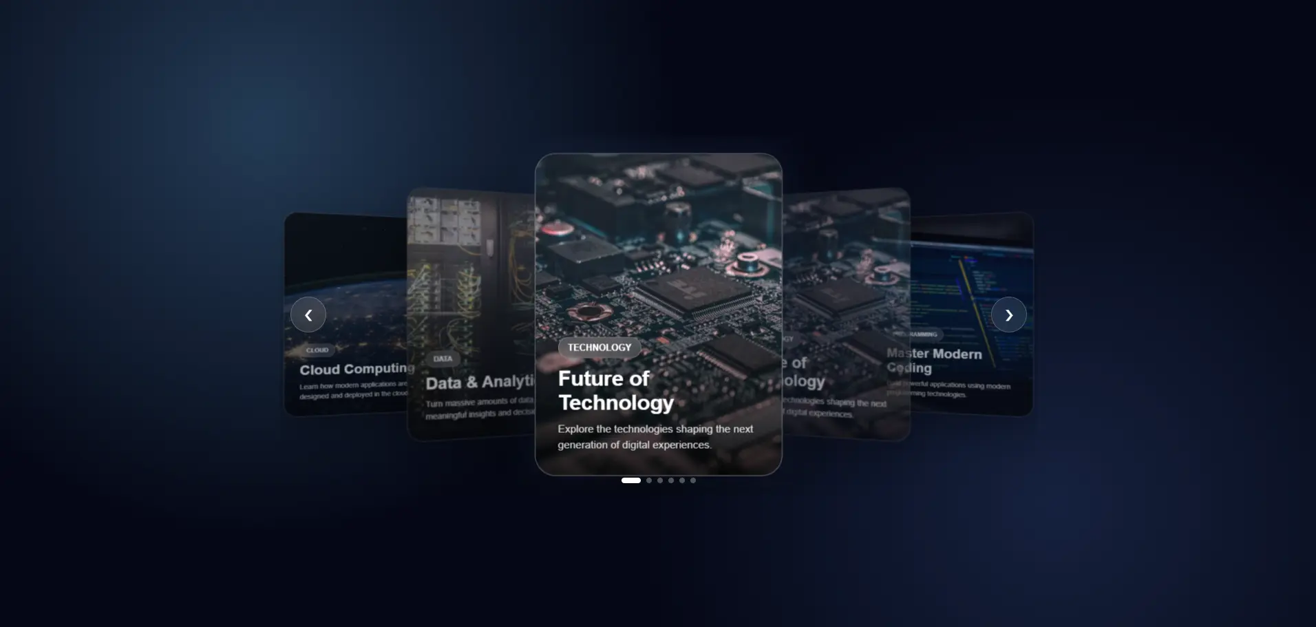
Understanding the Next-Generation 3D Carousel The uploaded code creates a modern, responsive, interactive 3D image carousel using only HTML, CSS, and JavaScript. The carousel contains multiple cards, places the cur...

Read Full Documentation →

R
Rohan Kumar
Posted on Aug 05, 2026 • ExpressJS

JWT Authentication Middleware (Using HTTP-Only Cookies)

npm install jsonwebtoken cookie-parser
const express = require("express");
const cookieParser = require("cookie-parser");

const app = express();

app.use(express.json());
app.use(cookieParser());

app.use("/api", require("./routes"));

module.exports = app;
PORT=5000

JWT_SECRET=your_super_secret_key_here
JWT_EXPIRES_IN=7d

NODE_ENV=development
const jwt = require("jsonwebtoken");

const token = jwt.sign(
    {
        userId: user._id,
        email: user.email,
        role: user.role
    },
    process.env.JWT_SECRET,
    {
        expiresIn: process.env.JWT_EXPIRES_IN
    }
);
res.cookie("token", token, {
    httpOnly: true,
    secure: process.env.NODE_ENV === "production",
    sameSite: "strict",
    maxAge: 7 * 24 * 60 * 60 * 1000
});

return res.status(200).json({
    success: true,
    message: "Login successful"
});
const jwt = require("jsonwebtoken");

const authMiddleware = (req, res, next) => {
    try {
        const token = req.cookies.token;

        if (!token) {
            return res.status(401).json({
                success: false,
                message: "Authentication required."
            });
        }

        const decoded = jwt.verify(
            token,
            process.env.JWT_SECRET
        );

        req.user = decoded;

        next();

    } catch (error) {

        if (error.name === "TokenExpiredError") {
            return res.status(401).json({
                success: false,
                message: "Session expired."
            });
        }

        if (error.name === "JsonWebTokenError") {
            return res.status(401).json({
                success: false,
                message: "Invalid authentication token."
            });
        }

        return res.status(500).json({
            success: false,
            message: "Internal Server Error"
        });
    }
};

module.exports = authMiddleware;
const express = require("express");
const authMiddleware = require("../middleware/auth.middleware");

const router = express.Router();

router.get("/profile", authMiddleware, (req, res) => {

    res.status(200).json({
        success: true,
        user: req.user
    });

});

module.exports = router;
const logout = (req, res) => {

    res.clearCookie("token", {
        httpOnly: true,
        secure: process.env.NODE_ENV === "production",
        sameSite: "strict"
    });

    res.status(200).json({
        success: true,
        message: "Logged out successfully."
    });

};

module.exports = logout;
const jwt = require("jsonwebtoken");

const login = async (req, res) => {

    const user = {
        _id: "68783b4a25d9ab1",
        email: "rohan@example.com",
        role: "user"
    };

    const token = jwt.sign(
        {
            userId: user._id,
            email: user.email,
            role: user.role
        },
        process.env.JWT_SECRET,
        {
            expiresIn: process.env.JWT_EXPIRES_IN
        }
    );

    res.cookie("token", token, {
        httpOnly: true,
        secure: process.env.NODE_ENV === "production",
        sameSite: "strict",
        maxAge: 7 * 24 * 60 * 60 * 1000
    });

    return res.status(200).json({
        success: true,
        message: "Login successful."
    });

};

module.exports = login;
router.get("/dashboard", authMiddleware, (req, res) => {

    console.log(req.user.userId);
    console.log(req.user.email);
    console.log(req.user.role);

    res.json({
        success: true,
        user: req.user
    });

});
project/
│
├── middleware/
│   └── auth.middleware.js
│
├── controllers/
│   ├── login.controller.js
│   └── logout.controller.js
│
├── routes/
│   └── index.js
│
├── app.js
├── server.js
└── .env

JWT (JSON Web Token) is one of the most popular methods for authenticating users in modern web applications. Instead of storing session data on the server, JWT stores user information inside a signed token that can be...

Read Full Documentation →
R
Rohan Kumar
Posted on Aug 05, 2026 • ReactJS

Interactive 3D Glassmorphism Card Component in React | Tilt Effect & Copy Button

import { useRef } from "react";
import "./GlassCard.css";

const GlassCard = ({
  image,
  badge,
  category,
  readTime,
  title,
  description,
  author,
  date,
  snippet,
}) => {
  const cardRef = useRef(null);
  const glareRef = useRef(null);
  const buttonRef = useRef(null);

  const handleMouseMove = (e) => {
    const card = cardRef.current;
    const glare = glareRef.current;

    const rect = card.getBoundingClientRect();

    const x = e.clientX - rect.left;
    const y = e.clientY - rect.top;

    const centerX = rect.width / 2;
    const centerY = rect.height / 2;

    const rotateX = ((y - centerY) / centerY) * -12;
    const rotateY = ((x - centerX) / centerX) * 12;

    card.style.transform = `rotateX(${rotateX}deg) rotateY(${rotateY}deg)`;

    glare.style.opacity = "1";

    glare.style.background = `radial-gradient(
      circle at ${x}px ${y}px,
      rgba(255, 255, 255, .18),
      transparent 60%
    )`;
  };

  const handleMouseLeave = () => {
    cardRef.current.style.transform = "rotateX(0deg) rotateY(0deg)";
    glareRef.current.style.opacity = "0";
  };

  const copyCode = async (e) => {
    e.stopPropagation();

    try {
      await navigator.clipboard.writeText(snippet);

      const btn = buttonRef.current;
      const text = btn.querySelector(".btn-text");
      const icon = btn.querySelector(".btn-icon");

      text.textContent = "Copied!";
      icon.textContent = "✅";

      btn.classList.add("copied");

      setTimeout(() => {
        text.textContent = "Copy Code";
        icon.textContent = "📋";
        btn.classList.remove("copied");
      }, 2000);
    } catch (err) {
      console.log(err);
    }
  };

  return (
    <div className="card-container">
      <div
        ref={cardRef}
        className="glass-card"
        onMouseMove={handleMouseMove}
        onMouseLeave={handleMouseLeave}
      >
        <div ref={glareRef} className="card-glare"></div>

        <div className="card-image-wrap">
          <img src={image} alt={title} className="card-img" />
          <span className="badge-tag">{badge}</span>
        </div>

        <div className="card-content">
          <div className="card-meta">
            <span className="meta-item">{category}</span>
            <span className="meta-item">{readTime}</span>
          </div>

          <h2 className="card-title">{title}</h2>

          <p className="card-description">{description}</p>

          <div className="card-footer">
            <div className="author-info">
              <div className="author-avatar">
                {author.charAt(0).toUpperCase()}
              </div>

              <div>
                <div className="author-name">{author}</div>
                <div className="post-date">{date}</div>
              </div>
            </div>

            <button
              ref={buttonRef}
              className="btn-copy"
              onClick={copyCode}
            >
              <span className="btn-text">Copy Code</span>
              <span className="btn-icon">📋</span>
            </button>
          </div>
        </div>
      </div>
    </div>
  );
};

export default GlassCard;
/* ========================================================
   GLOBAL RESETS & GLASSLAND BACKGROUND
   ======================================================== */

* {
  margin: 0;
  padding: 0;
  box-sizing: border-box;
  font-family: "Segoe UI", system-ui, -apple-system, sans-serif;
}

body {
  min-height: 100vh;
  display: flex;
  justify-content: center;
  align-items: center;

  background: #0B0F19;

  background-image:
    radial-gradient(
      at 0% 0%,
      rgba(99, 102, 241, 0.18) 0px,
      transparent 50%
    ),
    radial-gradient(
      at 100% 100%,
      rgba(168, 85, 247, 0.18) 0px,
      transparent 50%
    );

  overflow: hidden;
  padding: 1.5rem;
}

/* Container for 3D perspective field */

.card-container {
  perspective: 1000px;
}

/* ========================================================
   STYLISH GLASS CARD
   ======================================================== */

.glass-card {
  width: 360px;

  background: rgba(17, 24, 39, 0.7);

  backdrop-filter: blur(16px);
  -webkit-backdrop-filter: blur(16px);

  border: 1px solid rgba(255, 255, 255, 0.1);
  border-radius: 20px;

  padding: 1.25rem;

  box-shadow:
    0 20px 40px rgba(0, 0, 0, 0.6),
    inset 0 1px 0 rgba(255, 255, 255, 0.15);

  position: relative;
  overflow: hidden;

  transform-style: preserve-3d;

  transition:
    transform 0.15s ease-out,
    box-shadow 0.3s ease;

  cursor: pointer;
}

.glass-card:hover {
  box-shadow:
    0 30px 60px rgba(0, 0, 0, 0.8),
    0 0 30px rgba(99, 102, 241, 0.25),
    inset 0 1px 0 rgba(255, 255, 255, 0.25);
}

/* Dynamic Glare Effect Overlay */

.card-glare {
  position: absolute;

  top: 0;
  left: 0;

  width: 100%;
  height: 100%;

  pointer-events: none;

  background: radial-gradient(
    circle at 50% 50%,
    rgba(255, 255, 255, 0.15),
    transparent 60%
  );

  opacity: 0;

  transition: opacity 0.3s ease;

  z-index: 5;
}

/* ========================================================
   CARD MEDIA & BADGE
   ======================================================== */

.card-image-wrap {
  position: relative;

  width: 100%;
  height: 190px;

  border-radius: 14px;
  overflow: hidden;

  transform: translateZ(20px);
}

.card-img {
  width: 100%;
  height: 100%;

  object-fit: cover;

  transition:
    transform 0.5s cubic-bezier(0.4, 0, 0.2, 1);
}

.glass-card:hover .card-img {
  transform: scale(1.08);
}

.badge-tag {
  position: absolute;

  top: 12px;
  right: 12px;

  background: rgba(17, 24, 39, 0.75);

  backdrop-filter: blur(8px);

  color: #818CF8;

  font-size: 0.75rem;
  font-weight: 700;

  padding: 0.35rem 0.75rem;

  border-radius: 50px;

  border: 1px solid rgba(99, 102, 241, 0.4);

  box-shadow: 0 4px 12px rgba(0, 0, 0, 0.3);
}

/* ========================================================
   CARD TYPOGRAPHY & BODY
   ======================================================== */

.card-content {
  margin-top: 1.25rem;

  transform: translateZ(30px);
}

.card-meta {
  display: flex;

  gap: 0.75rem;

  font-size: 0.75rem;

  color: #9CA3AF;

  margin-bottom: 0.5rem;
}

.card-title {
  color: #F9FAFB;

  font-size: 1.25rem;
  font-weight: 700;

  line-height: 1.35;

  margin-bottom: 0.5rem;

  transition: color 0.2s ease;
}

.glass-card:hover .card-title {
  color: #818CF8;
}

.card-description {
  color: #9CA3AF;

  font-size: 0.85rem;

  line-height: 1.5;

  margin-bottom: 1.25rem;

  display: -webkit-box;

  -webkit-line-clamp: 3;

  -webkit-box-orient: vertical;

  overflow: hidden;
}

/* ========================================================
   FOOTER & INTERACTIVE BUTTON
   ======================================================== */

.card-footer {
  display: flex;

  align-items: center;

  justify-content: space-between;

  padding-top: 1rem;

  border-top: 1px solid rgba(255, 255, 255, 0.08);

  transform: translateZ(25px);
}

.author-info {
  display: flex;

  align-items: center;

  gap: 0.6rem;
}

.author-avatar {
  width: 34px;
  height: 34px;

  border-radius: 50%;

  background: linear-gradient(
    135deg,
    #6366F1,
    #A855F7
  );

  color: #ffffff;

  font-weight: 700;

  font-size: 0.85rem;

  display: flex;

  align-items: center;

  justify-content: center;

  border: 1px solid rgba(255, 255, 255, 0.2);
}

.author-name {
  color: #F9FAFB;

  font-size: 0.8rem;

  font-weight: 600;
}

.post-date {
  color: #6B7280;

  font-size: 0.7rem;
}

.btn-copy {
  background: linear-gradient(
    135deg,
    #6366F1,
    #4F46E5
  );

  color: #ffffff;

  border: none;

  border-radius: 8px;

  padding: 0.5rem 0.85rem;

  font-size: 0.8rem;

  font-weight: 600;

  cursor: pointer;

  display: flex;

  align-items: center;

  gap: 0.35rem;

  transition:
    all 0.2s cubic-bezier(0.4, 0, 0.2, 1);

  box-shadow:
    0 4px 12px rgba(99, 102, 241, 0.3);
}

.btn-copy:hover {
  transform: translateY(-2px);

  box-shadow:
    0 6px 16px rgba(99, 102, 241, 0.5);
}

.btn-copy:active {
  transform: translateY(0);
}

.btn-copy.copied {
  background: #10B981;

  box-shadow:
    0 4px 12px rgba(16, 185, 129, 0.4);
}
import GlassCard from "./components/GlassCard";

function App() {
  return (
    <div
      style={{
        minHeight: "100vh",

        display: "flex",

        justifyContent: "center",

        alignItems: "center",

        background: "#0B0F19",
      }}
    >
      <GlassCard
        image="https://images.unsplash.com/photo-1618005182384-a83a8bd57fbe?w=600&auto=format&fit=crop&q=80"
        badge="⚡ React"
        category="📁 Components"
        readTime="⏱️ 5 min read"
        title="Reusable Glass Card"
        description="A reusable glassmorphism card component with 3D tilt effect, glare animation and copy button."
        author="Rohan Kumar"
        date="Aug 5, 2026"
        snippet="npm install react"
      />
    </div>
  );
}

export default App;
src/
│
├── components/
│   ├── GlassCard.jsx
│   └── GlassCard.css
│
├── App.jsx
└── main.jsx

Modern websites often use interactive UI components to make the user experience more engaging. One popular design trend is glassmorphism, where elements use transparency, blur effects, subtle borders, shadows, and gra...

Read Full Documentation →
R
Rohan Kumar
Posted on Jul 29, 2026 • HTML / CSS / JAVASCRIPT

3D Tilt Glassmorphism Card with Interactive Glare & Copy Snippet

<div class="card-container">
        <div class="glass-card" id="tiltCard">
            <!-- Dynamic Glare Highlight Overlay -->
            <div class="card-glare"></div>

            <div class="card-image-wrap">
                <img src="https://images.unsplash.com/photo-1618005182384-a83a8bd57fbe?w=600&auto=format&fit=crop&q=80" alt="Abstract Art" class="card-img">
                <span class="badge-tag">⚡ Angular 18</span>
            </div>

            <div class="card-content">
                <div class="card-meta">
                    <span class="meta-item">📁 Components</span>
                    <span class="meta-item">⏱️ 5 min read</span>
                </div>

                <h2 class="card-title">Reactive Signal Store System</h2>
                <p class="card-description">
                    A lightweight, production-ready state management pattern using native RxJS and Angular Signals without third-party libraries.
                </p>

                <div class="card-footer">
                    <div class="author-info">
                        <div class="author-avatar">R</div>
                        <div>
                            <div class="author-name">Rohan Kumar</div>
                            <div class="post-date">Jul 29, 2026</div>
                        </div>
                    </div>

                    <button class="btn-copy" id="copyBtn" data-snippet="npm i @angular/core@next">
                        <span class="btn-text">Copy Code</span>
                        <span class="btn-icon">📋</span>
                    </button>
                </div>
            </div>
        </div>
    </div>
/* ========================================================
   GLOBAL RESETS & GLASSLAND BACKGROUND
   ======================================================== */
* {
    margin: 0;
    padding: 0;
    box-sizing: border-box;
    font-family: 'Segoe UI', system-ui, -apple-system, sans-serif;
}

body {
    min-height: 100vh;
    display: flex;
    justify-content: center;
    align-items: center;
    background: #0B0F19;
    background-image: 
        radial-gradient(at 0% 0%, rgba(99, 102, 241, 0.18) 0px, transparent 50%),
        radial-gradient(at 100% 100%, rgba(168, 85, 247, 0.18) 0px, transparent 50%);
    overflow: hidden;
    padding: 1.5rem;
}

/* Container for 3D perspective field */
.card-container {
    perspective: 1000px;
}

/* ========================================================
   STYLISH GLASS CARD
   ======================================================== */
.glass-card {
    width: 360px;
    background: rgba(17, 24, 39, 0.7);
    backdrop-filter: blur(16px);
    -webkit-backdrop-filter: blur(16px);
    border: 1px solid rgba(255, 255, 255, 0.1);
    border-radius: 20px;
    padding: 1.25rem;
    box-shadow: 
        0 20px 40px rgba(0, 0, 0, 0.6),
        inset 0 1px 0 rgba(255, 255, 255, 0.15);
    position: relative;
    overflow: hidden;
    transform-style: preserve-3d;
    transition: transform 0.15s ease-out, box-shadow 0.3s ease;
    cursor: pointer;
}

.glass-card:hover {
    box-shadow: 
        0 30px 60px rgba(0, 0, 0, 0.8),
        0 0 30px rgba(99, 102, 241, 0.25),
        inset 0 1px 0 rgba(255, 255, 255, 0.25);
}

/* Dynamic Glare Effect Overlay */
.card-glare {
    position: absolute;
    top: 0;
    left: 0;
    width: 100%;
    height: 100%;
    pointer-events: none;
    background: radial-gradient(circle at 50% 50%, rgba(255, 255, 255, 0.15), transparent 60%);
    opacity: 0;
    transition: opacity 0.3s ease;
    z-index: 5;
}

/* ========================================================
   CARD MEDIA & BADGE
   ======================================================== */
.card-image-wrap {
    position: relative;
    width: 100%;
    height: 190px;
    border-radius: 14px;
    overflow: hidden;
    transform: translateZ(20px); /* Lift element in 3D space */
}

.card-img {
    width: 100%;
    height: 100%;
    object-fit: cover;
    transition: transform 0.5s cubic-bezier(0.4, 0, 0.2, 1);
}

.glass-card:hover .card-img {
    transform: scale(1.08);
}

.badge-tag {
    position: absolute;
    top: 12px;
    right: 12px;
    background: rgba(17, 24, 39, 0.75);
    backdrop-filter: blur(8px);
    color: #818CF8;
    font-size: 0.75rem;
    font-weight: 700;
    padding: 0.35rem 0.75rem;
    border-radius: 50px;
    border: 1px solid rgba(99, 102, 241, 0.4);
    box-shadow: 0 4px 12px rgba(0, 0, 0, 0.3);
}

/* ========================================================
   CARD TYPOGRAPHY & BODY
   ======================================================== */
.card-content {
    margin-top: 1.25rem;
    transform: translateZ(30px); /* Deeper 3D depth */
}

.card-meta {
    display: flex;
    gap: 0.75rem;
    font-size: 0.75rem;
    color: #9CA3AF;
    margin-bottom: 0.5rem;
}

.card-title {
    color: #F9FAFB;
    font-size: 1.25rem;
    font-weight: 700;
    line-height: 1.35;
    margin-bottom: 0.5rem;
    transition: color 0.2s ease;
}

.glass-card:hover .card-title {
    color: #818CF8;
}

.card-description {
    color: #9CA3AF;
    font-size: 0.85rem;
    line-height: 1.5;
    margin-bottom: 1.25rem;
    display: -webkit-box;
    -webkit-line-clamp: 3;
    -webkit-box-orient: vertical;
    overflow: hidden;
}

/* ========================================================
   FOOTER & INTERACTIVE BUTTON
   ======================================================== */
.card-footer {
    display: flex;
    align-items: center;
    justify-content: space-between;
    padding-top: 1rem;
    border-top: 1px solid rgba(255, 255, 255, 0.08);
    transform: translateZ(25px);
}

.author-info {
    display: flex;
    align-items: center;
    gap: 0.6rem;
}

.author-avatar {
    width: 34px;
    height: 34px;
    border-radius: 50%;
    background: linear-gradient(135deg, #6366F1, #A855F7);
    color: #ffffff;
    font-weight: 700;
    font-size: 0.85rem;
    display: flex;
    align-items: center;
    justify-content: center;
    border: 1px solid rgba(255, 255, 255, 0.2);
}

.author-name {
    color: #F9FAFB;
    font-size: 0.8rem;
    font-weight: 600;
}

.post-date {
    color: #6B7280;
    font-size: 0.7rem;
}

.btn-copy {
    background: linear-gradient(135deg, #6366F1, #4F46E5);
    color: #ffffff;
    border: none;
    border-radius: 8px;
    padding: 0.5rem 0.85rem;
    font-size: 0.8rem;
    font-weight: 600;
    cursor: pointer;
    display: flex;
    align-items: center;
    gap: 0.35rem;
    transition: all 0.2s cubic-bezier(0.4, 0, 0.2, 1);
    box-shadow: 0 4px 12px rgba(99, 102, 241, 0.3);
}

.btn-copy:hover {
    transform: translateY(-2px);
    box-shadow: 0 6px 16px rgba(99, 102, 241, 0.5);
}

.btn-copy:active {
    transform: translateY(0);
}

.btn-copy.copied {
    background: #10B981;
    box-shadow: 0 4px 12px rgba(16, 185, 129, 0.4);
}
document.addEventListener('DOMContentLoaded', () => {
    const card = document.getElementById('tiltCard');
    const glare = card.querySelector('.card-glare');
    const copyBtn = document.getElementById('copyBtn');

    /* ========================================================
       1. 3D MOUSE TILT & GLARE EFFECT
       ======================================================== */
    card.addEventListener('mousemove', (e) => {
        const rect = card.getBoundingClientRect();
        
        // Calculate mouse position relative to card center (-1 to 1)
        const x = e.clientX - rect.left;
        const y = e.clientY - rect.top;
        
        const centerX = rect.width / 2;
        const centerY = rect.height / 2;
        
        const rotateX = ((y - centerY) / centerY) * -12; // Max 12deg tilt
        const rotateY = ((x - centerX) / centerX) * 12;

        // Apply 3D rotation transform
        card.style.transform = `rotateX(${rotateX}deg) rotateY(${rotateY}deg)`;

        // Adjust dynamic glare position & intensity
        glare.style.opacity = '1';
        glare.style.background = `radial-gradient(circle at ${x}px ${y}px, rgba(255, 255, 255, 0.18), transparent 60%)`;
    });

    // Reset card tilt when mouse leaves
    card.addEventListener('mouseleave', () => {
        card.style.transform = 'rotateX(0deg) rotateY(0deg)';
        glare.style.opacity = '0';
    });

    /* ========================================================
       2. INTERACTIVE COPY TO CLIPBOARD BUTTON
       ======================================================== */
    copyBtn.addEventListener('click', (e) => {
        e.stopPropagation(); // Prevent card triggers
        
        const textToCopy = copyBtn.getAttribute('data-snippet');
        
        navigator.clipboard.writeText(textToCopy).then(() => {
            const btnText = copyBtn.querySelector('.btn-text');
            const btnIcon = copyBtn.querySelector('.btn-icon');
            
            // Visual feedback update
            btnText.textContent = 'Copied!';
            btnIcon.textContent = '✅';
            copyBtn.classList.add('copied');

            // Reset back after 2 seconds
            setTimeout(() => {
                btnText.textContent = 'Copy Code';
                btnIcon.textContent = '📋';
                copyBtn.classList.remove('copied');
            }, 2000);
        }).catch(err => {
            console.error('Failed to copy text: ', err);
        });
    });
});
🔖 Bookmark saved successfully!